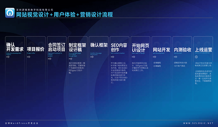
WordPress Tutorial: Custom Page Design with Elementor
If you want to create a professional and personalized WordPress page but don’t want to get bogged down by complicated code, then the Elementor Editor is the ideal tool for you. This tutorial will guide you step-by-step from scratch, teaching you how to use Elementor to lay out pages and build page elements, making your WordPress site more attractive and functional. This is a tutorial for creating and editing WordPress pages from scratch. We’ll start by creating a new page in the WordPress Backend, then proceed to build the header, main content, and footer, using Elementor’s visual components to complete layout, add content, adjust styles, and more. This is not just a basic tutorial, but a hands-on practice process. While following the steps usually works smoothly, the development of page elements is often full of variables, and issues such as plugin conflicts and style abnormalities may arise. Therefore, in addition to learning how to use Elementor, readers will also need to develop a keen eye for troubleshooting and problem-solving to truly master this powerful tool. Whether you are a WordPress beginner or someone looking to improve page editing skills, this article will provide you with practical guidance to help you efficiently complete web design and element creation. Now, let’s take a look at the content of this article’s table of contents before we dive into the main topic.
To help readers learn and reference more efficiently, the author has systematically organized the article "WordPress Tutorial: Customizing and Building Pages from Scratch with Elementor Editor" and created a clear table of contents. Each section not only visually presents the structure of the article but also includes anchor links, allowing you to jump directly to the content you're interested in, easily revisit, or dive deeper into a specific part. Whether you wish to learn from start to finish or need to quickly locate a particular step during the process, this table of contents allows for the reading experience you want, ensuring a smoother and more efficient learning process. The details of the table of contents are as follows:
- Creating a New Page in WordPress Backend
- Create a Header (Header and Navigation Bar) Template File in Elementor’s Theme Builder
- Elementor Theme Builder Entrance
- Add Template File in Elementor’s Header Template File Management Interface
- Choose a Header Template Style or Fully Customize the Style
- Use Elementor’s Container to Layout the Header and Navigation Bar
- Edit and Create Element Content for the Header and Navigation Bar
- Publish the Header Template File and Set Display Conditions
- Build the Main Framework of the Page with Elementor and Add Content Elements
- Create a Footer Template File with Elementor
Ⅰ、Creating a New Page in WordPress Backend
Before officially using the Elementor editor to build a WordPress page, the first step is to ensure that the page itself has already been created in the WordPress backend. The path to access the page management in WordPress is shown in the image above. In this section, we will start with WordPress's page management function and explain in detail how to create a new page and fill in necessary information, such as the page title, URL settings, page hierarchy, and publishing the page. Creating the page is the foundation of the entire website construction. Properly setting page properties not only enhances the efficiency of subsequent editing but also helps avoid layout or compatibility issues when using Elementor. Once the page is ready, we can seamlessly switch to Elementor editing mode to begin the layout and design of the page elements.
1、Fill in the Page Title
After entering the page management interface in the WordPress backend and clicking the "Add New" button at the top of the page, we are brought to the new page operation interface as shown in the image above. In the title input box highlighted with a red box in the image above, customize and enter the page title. In the WordPress system, this page title serves not only as the displayed title in the page management but also as the text content in the title tag of the page's frontend code. Therefore, when customizing the title, it is important to consider the role of SEO.
2、Customize the Page URL Suffix
As shown in the image above, after entering the page title, click on the "Link" anchor text highlighted in the red box on the right. The system will pop up a custom URL input box. By default, WordPress automatically uses the page title as the URL suffix. However, this default method often does not comply with SEO best practices because the title may contain non-English characters or be too long, which affects user readability and search engine optimization. The ideal URL should be as short as possible and use English words to improve readability and search engine friendliness.
3、Set the Page Hierarchy
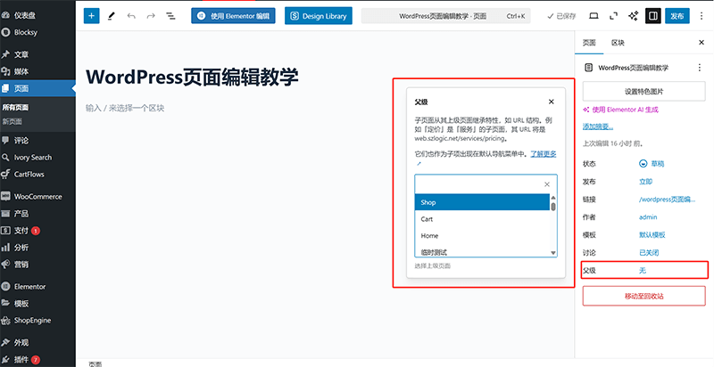
The page hierarchy setting is used to define the relationship between WordPress pages. Unlike posts, which can be categorized into taxonomies, pages support a hierarchical structure. For example, the URL structure `szlogic/web-design` represents the "Web Design" page of "Logic Digital Technology." If this page is set as a parent page, the URL of its child pages will follow the format `szlogic/web-design/your-page-url-suffix`. To set the page hierarchy, as shown in the image above, click on the "Parent" option in the "Page" section on the right side of the editing interface. This will open a parent page selection window. After selecting the appropriate parent page, the system will automatically adjust the URL structure to reflect the hierarchy. It is important to note that setting a page hierarchy is optional. If you do not need to specify a parent page for the page, you can simply leave the default setting.
4、Publish the New WordPress Page
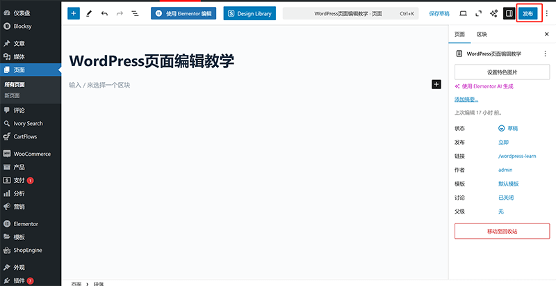
Once the necessary page information is set, we can proceed to publish the page. Only after publishing will the page become part of the website structure and be accessible via its URL. After clicking the "Publish" button highlighted in the red box in the image above, the page will redirect to a pre-publishing review interface. On this page, simply click the "Publish" button again to complete the task of publishing the new page.
5、Editing the Page with Elementor
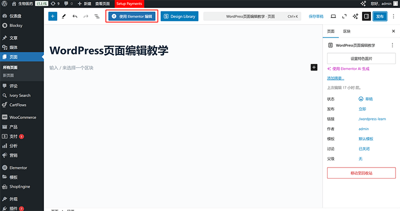
Setting Elementor to edit the page is the final step of creating a new WordPress page. The first time you enter Elementor edit mode for the newly created page, you must click the "Edit with Elementor" button highlighted in the red box in the page management mode as shown in the image above. After entering Elementor edit mode for the first time, subsequent entries can be done directly through the frontend page without needing to access the backend. The reason behind this is that the first entry serves as granting Elementor permission to edit that page, so backend operation is required only for the initial entry.
Ⅱ、Create a Header (Header and Navigation Bar) Template File in Elementor’s Theme Builder
模板文件.png)
In a WordPress website, the header and navigation bar are crucial global elements. They not only influence the overall style of the site but also directly impact the user browsing experience. Since the header typically needs to remain consistent across all pages, we can leverage Elementor's Theme Builder feature to create a reusable header template, achieving a unified display across the entire site. In this section, we will introduce how to use Elementor's template file management feature to design a header from scratch that meets the website's needs. You will learn how to add common elements like a logo, navigation menu, and search bar, and make personalized adjustments through Elementor's drag-and-drop operation. After completing the template design, when publishing the template file, we will also explain how to select "Apply to entire site" in the control conditions to ensure that the header automatically applies to all pages. Once you master this technique, not only can you create a beautiful and functional header, but you can also update it with one click in the future, without needing to adjust each page individually. Now, let's start creating your website's unique header!
1、Elementor Theme Builder Entrance
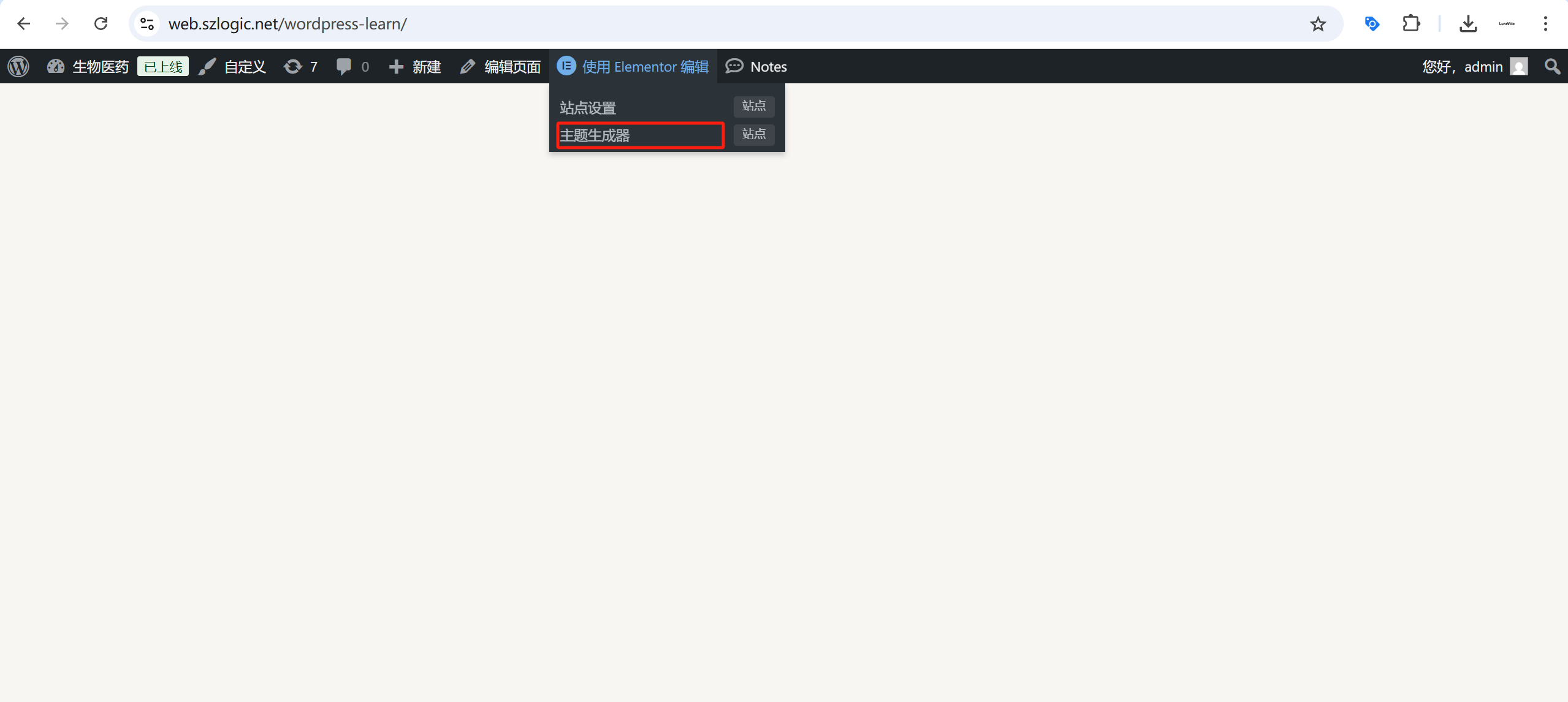
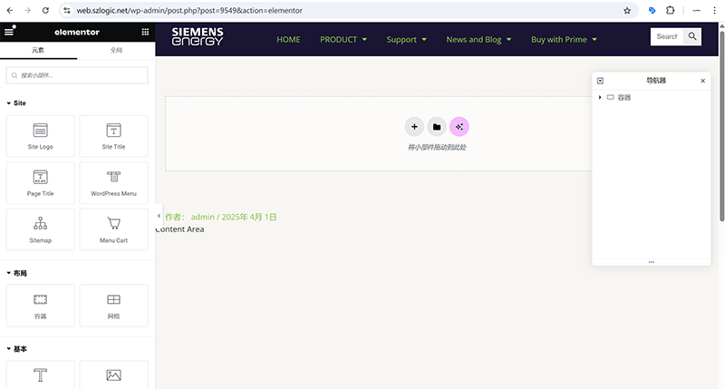
When visiting the published page in the browser, if the WordPress website backend login is still active in the same browser, a management toolbar will appear at the top of the page, as shown in the image above. When you hover over the "Edit with Elementor" anchor text, a dropdown menu for Elementor will appear, and the entry to the "Theme Builder" is hidden here. By clicking the "Theme Builder" link, as highlighted in the red box above, you can access the management page for Elementor's theme template files.
2、Add Template File in Elementor’s Header Template File Management Interface
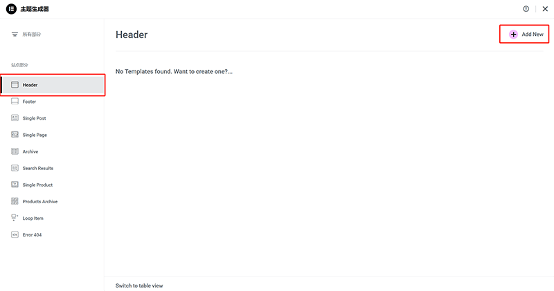
After entering the Elementor Theme Builder homepage, click the "Header" category at the top of the template file directory on the left. This will bring you to the "Header" template file management page, as shown in the image above. No additional operations are required; simply click the "Add New" button in the top right corner of the operation interface, as highlighted in the red box in the image above, to create a new Header template file.
3、Choose a Header Template Style or Fully Customize the Style
模板样式或创建Header样式.png)
After clicking the "Add New" button in the Header template file management page in the previous step, the page will automatically redirect to the Elementor Header module selection interface, as shown in the image above. In the image, we can see that Elementor provides some pre-designed Header templates for us to choose from. In this operation interface, you can either directly select and load an Elementor Header style, or click the "X" button in the top right corner of the selection window to close the Header module style selection window and fully customize a website's header/navigation bar.
4、Use Elementor’s Container to Layout the Header and Navigation Bar
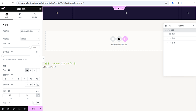
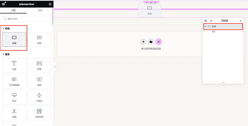
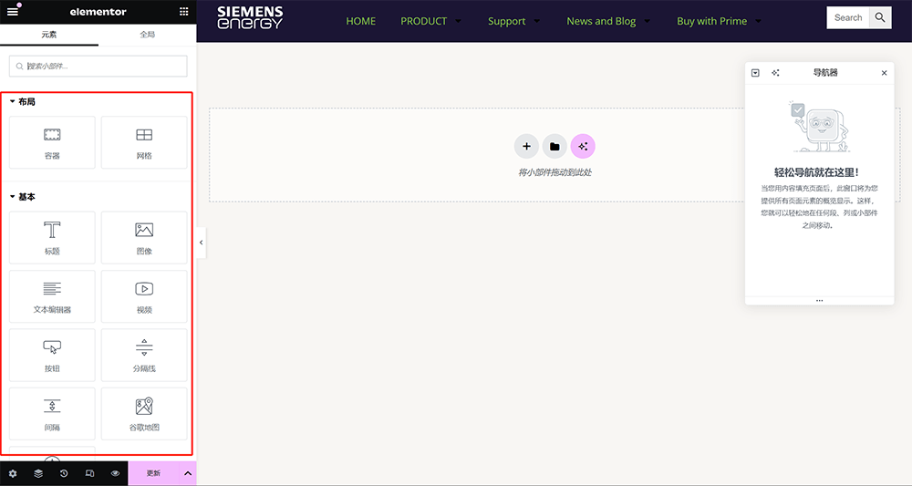
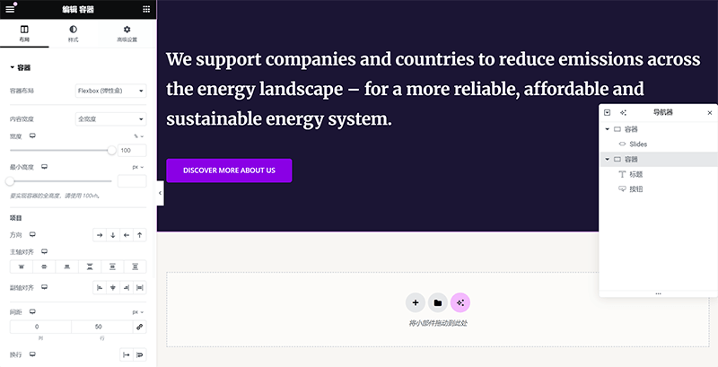
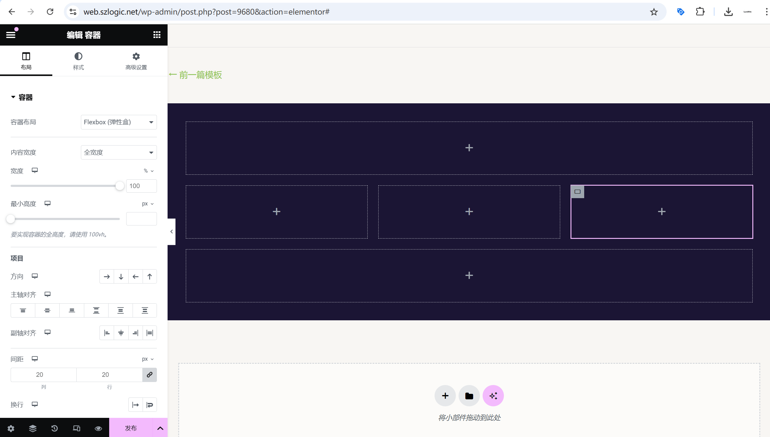
In the Header template editing mode, the header style designed with Elementor's container layout is shown in the above image. On the frontend code level, all webpage structures are made up of block elements (usually presented with the HTML layout, which are commonly referred to as the "box model"). As a visual page editor, Elementor follows the same logic, but it provides a visual interface and container components to help us construct the basic layout of the page and arrange other elements neatly within it. Therefore, before formally adding the header and navigation bar elements, we need to plan their structure carefully and use Elementor's container components for layout settings. To achieve flexible use of container components, we must deeply understand the container parameter settings and container nesting operations introduced in this section. Containers, as the core of the layout structure, not only determine the arrangement of content but also affect the responsive performance of the page and the user experience. At the same time, the number of containers is related to the number of page elements. Typically, one container holds one element component. The common element components in the header section are: Site Logo, WordPress Menu, and Search, which correspond to the website LOGO, the WordPress menu, and the search bar.
(1) Container Width Settings
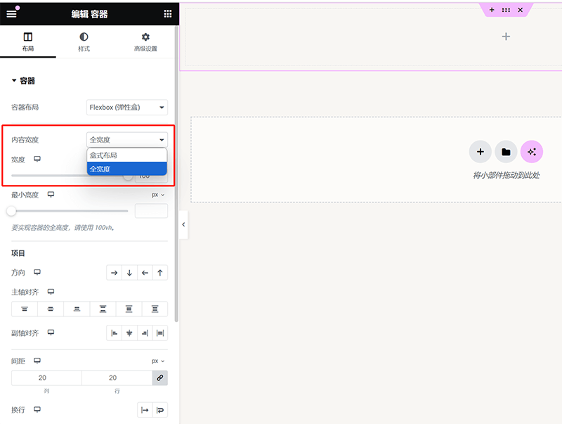
As shown in the image above, the container width setting determines the display range of page elements. Many beginners may encounter issues where elements cannot be displayed in full screen. The root cause is usually that the container width is not set to "Full Width" and the container padding is not set to 0. If you want page elements to have margins, you can choose "Boxed Layout"; if you need full-screen display, the container width should be adjusted to "Full Width" and the container padding should be set to 0 as described below. Both settings need to be correctly configured to make the content fill the entire screen.
(2) Container Padding/Spacing Settings
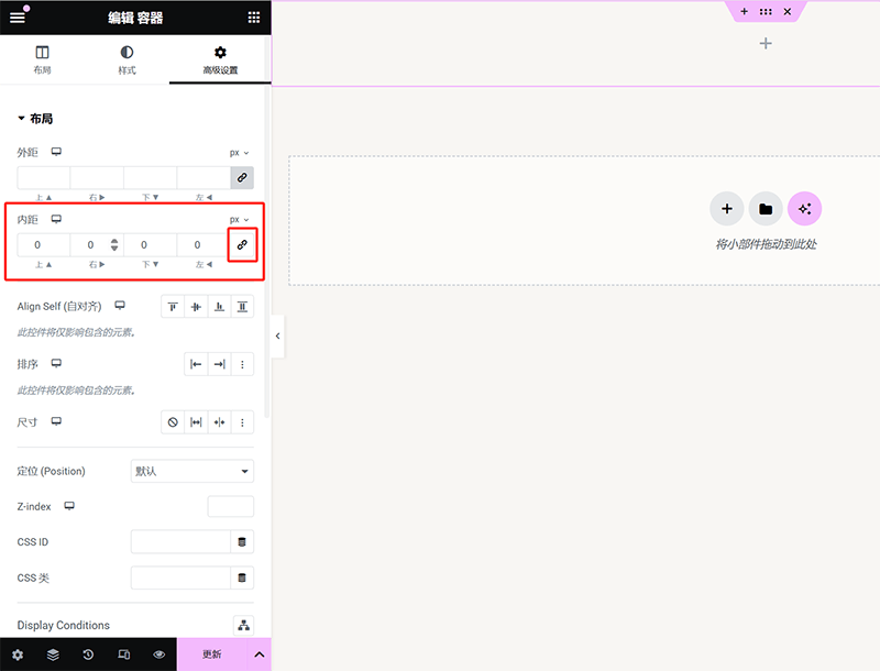
As shown in the image above, the padding and margin settings for an Elementor container are located under the "Advanced Settings" tab. The top section provides options for adjusting the margin in all four directions. By default, Elementor locks the values for margin and padding to keep them consistent across all four directions. To adjust the distance for a specific direction, you need to click the "link" icon marked in the red box to unlock the settings, then enter the desired value for the corresponding direction. Additionally, users can click on the px (default unit) above the lock icon and choose other size units, such as em, rem, %, etc., from the dropdown menu to suit different design needs. It’s worth noting that Elementor defaults the padding to 10px, and once unlocked, the system will automatically reset the padding value to 0. You will need to manually set an appropriate value based on actual needs.
(3) Container Nesting Method
As shown in the image above, there are two methods to implement Elementor container nesting. Both methods are effective for nesting containers: dragging and dropping, and copying and pasting in the Navigator. The drag-and-drop method is more intuitive and suitable for creating structures from scratch, while copying and pasting is ideal for quickly adjusting and reusing containers based on an existing layout.
Drag and Drop to Add Child Container
As shown in the image above, you can directly drag the container component from the Elementor left sidebar and drop it into the target parent container. This will automatically assign the new container to the parent container, forming a hierarchical structure.
Copy and Paste Container
In the Navigator panel on the right side of the Elementor interface, you can first select the container that needs to be nested, then perform a copy operation. After that, select the target parent container, right-click, and paste. The copied container will be nested under the parent container as a child container.
(4) Setting the Alignment Direction of Child Containers
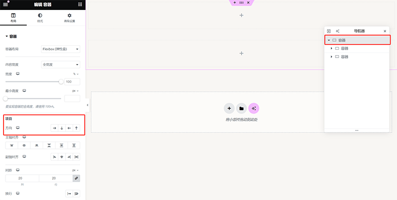
The alignment direction of Elementor child containers is determined by the parent container. This setting can be found under the "Layout" tab, as highlighted in the red box in the image above. Under the "Items" section, you can choose the arrangement of the containers, including horizontal and vertical alignment, and further adjust the specific alignment direction. When horizontal alignment is selected, child containers will be arranged horizontally, and you can set the order to be from left to right or from right to left, depending on the layout needs. If vertical alignment is chosen, the child containers will stack vertically and can be adjusted to go from top to bottom or from bottom to top. These directional settings directly affect the layout of child containers within the parent container. Proper configuration not only allows for flexible page element layout but also enhances the overall design's sense of hierarchy.
5、Edit and Create Element Content for the Header and Navigation Bar
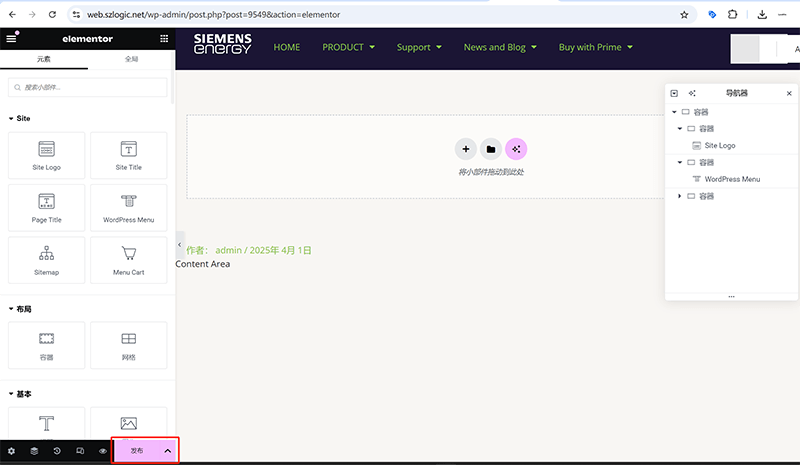
After completing the basic layout for the header and navigation bar in the previous steps, the next step is to add specific element components to give it full navigation and branding capabilities. Elementor provides several components suitable for the header, with the most common and practical ones being Site Logo, WordPress Menu, and Search. By dragging and dropping these components into the corresponding containers and uploading the necessary materials and settings, a fully functional header structure can be achieved. The screenshot above shows the result of uploading the logo material for the Site Logo component and setting the display conditions for the WordPress Menu.
6、Publish the Header Template File and Set Display Conditions
(1) Publish the Header Template File
After completing the layout of the header section using Elementor's container components, and adding common components and uploading materials, you can publish the Header template file to officially apply it to the page. In Elementor's editing mode, the "Publish" button is located at the bottom of the left sidebar, as highlighted in the red box in the image above. After clicking the "Publish" button, a display logic settings window will pop up, guiding users to define the scope of this header template.
(2) Set Display Conditions for the Header Template File
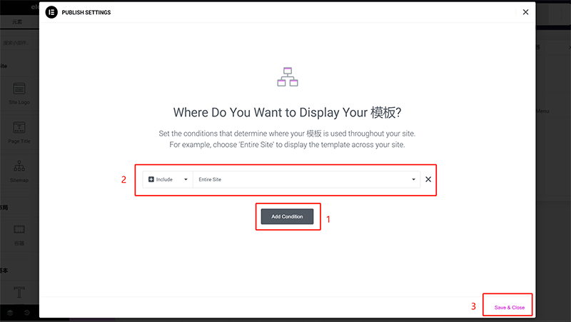
In the display logic settings window shown in the image above, users can choose to apply the header to the entire website, specific pages, post categories, or other custom conditions. Since the Header template file is a global part of the WordPress website, it needs to ensure that it works across all pages. Following the sequence shown in the image above, select Include > Entire Site in the display logic settings window, which means this header template will apply to all pages on the site. After making the selection, click the "Save & Close" button to apply and close the operation window. The system will automatically apply the Header template to all pages of the website.
Ⅲ、Build the Main Framework of the Page with Elementor and Add Content Elements
After completing the layout and creation of the header and navigation bar, the next step is to build the main content area of the page. Similar to the previous section on "Using Elementor Containers to Layout the Header and Navigation Bar," the design of the main content area also relies on Elementor's container components. The difference is that the main section typically contains richer content elements, such as text, images, icons, videos, buttons, forms, and more, all of which have corresponding components available in Elementor. In practice, by mastering the adjustments to container width, setting inner and outer margins, and using the nesting of sub-containers, you can achieve various page layouts. For example, using appropriate column layouts can create tidy content distribution, and by adjusting adaptive width and spacing, the page can maintain a good visual effect across different screen sizes. This is one of Elementor's strengths, allowing users to freely build diverse page structures without needing to write code.
Therefore, when designing the main content area, it is crucial to plan the container structure carefully. A clear and organized container hierarchy not only ensures beautiful typography but also enhances responsiveness, ensuring the best browsing experience on different devices. Next, the blogger will explain step by step how to use Elementor's container components to layout the main content area in a top-down order and apply element components, making the page more dynamic and layered!
1、Banner Section
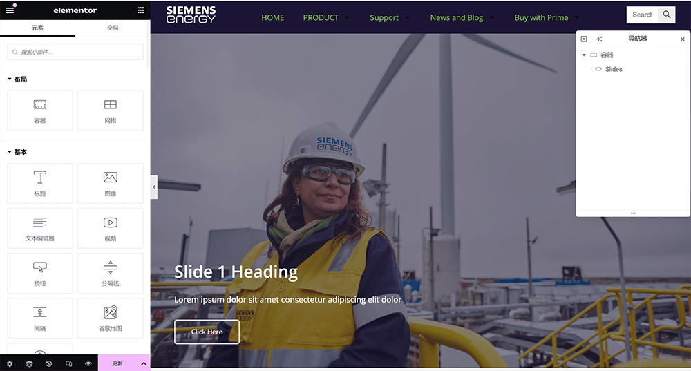
In the Banner section, generally, only one element component is needed, which is Elementor's Slides component. The Slides component is used to implement image carousel blocks on a page, and it comes with built-in features for setting titles, text, and links. Therefore, there is no need for multiple nested containers in the Banner section; a single container placed at the top is sufficient.
(1) Common Settings for the Slides Component
Background Settings
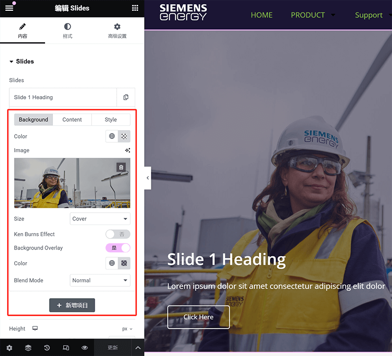
As shown in the image above, after expanding the Carousel tab, the background settings options as marked in the red box will appear. In this area, you can upload the background image for the carousel block, set the background color, and under the "Content" tab at the top, you can input the title, description, and button text, as well as set the button's URL.
Content Positioning Settings
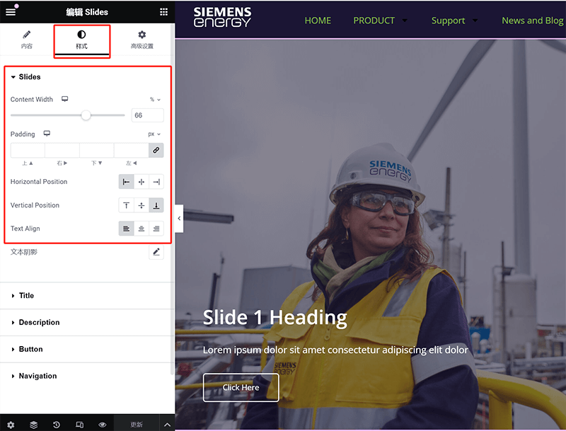
Under the "Style" tab in the settings area of the Slides component, you can set the custom positioning of the content. The positioning parameters that can be set from top to bottom are: content width, padding, horizontal direction, vertical direction, and text alignment. Through these positioning settings, you can customize the layout of the title, description text, and button.
Text Style Settings
The text style settings, as shown in the image above, are also located under the "Style" tab, just like the "Content Positioning Settings" mentioned above. In the image, the text types (title, description, button) are highlighted in the red box. By clicking on the corresponding text type, you can customize the font size, color, and other styles in the expanded CSS style settings.
2、Business Description Section
The elements in the business description section can be flexibly combined with various component types according to specific page design requirements. Generally speaking, the more elements there are in the description section, the more components are required. Unlike the common Slides widget used in the Banner section above, there is no fixed number of components for other sections on the page; instead, the components are freely arranged based on content needs. Taking the business description section shown in the image above as an example, this section only uses the title and button components, with an overall simple and intuitive design. Next, I will explain the common settings for these two components to help you better master their application techniques.
(1) Common Settings for the Title Widget
Settings under the "Content" Tab of the Title Widget
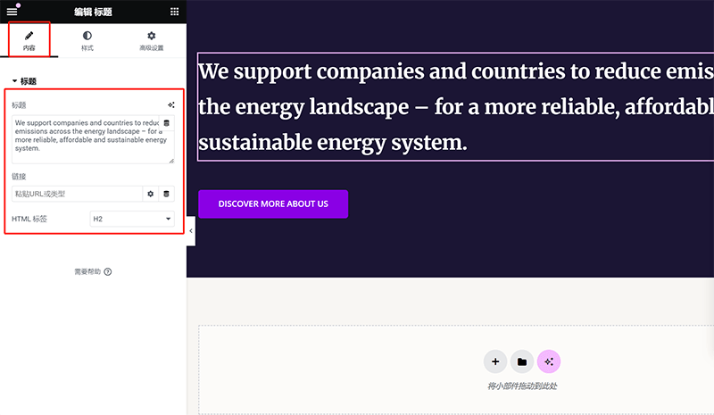
After selecting the title widget in Elementor's navigator, as shown in the image above, the component settings area on the left will default to the "Content" tab. This tab mainly includes three important settings: the title content input field, the title link input field, and the HTML Hn tag settings. The title content input is a required field and determines the text content displayed on the page. The link input field is optional, and whether to add a link depends on specific requirements; in most cases, the title does not include a link. The HTML Hn tag settings are crucial for SEO optimization. Correctly choosing H1, H2, H3, and other tags helps search engines recognize the page structure. Proper configuration can enhance the website's readability and ranking performance. Therefore, when editing the title widget, in addition to ensuring the content is accurate, it's important to set the HTML tags based on the page structure and SEO requirements.
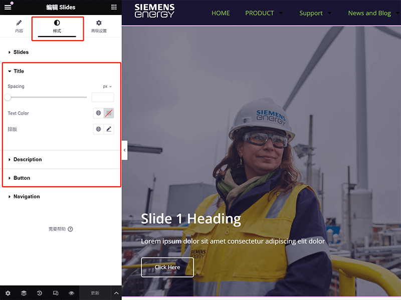
Style Settings under the "Style" Tab of the Title Widget
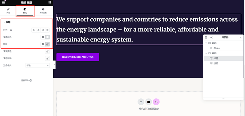
If you haven’t yet grasped the general location of Elementor component style settings, here’s a small tip: the style settings for all Elementor components are located under the "Style" tab in the component settings panel. Although the specific style options for different components vary, the path to access them is the same. For example, in the Title widget, as highlighted in the red box in the image above, the common style settings include title alignment, title text color, and typography settings. In the typography options, you can adjust the font type, font size, font weight, line height, and other styles to ensure the title’s visual effect matches the overall page design. Once you familiarize yourself with this rule, whether modifying the styles of titles, buttons, images, or other components, you will be able to quickly find the corresponding settings.
(2) Common Settings for the Button Widget
Settings under the "Content" Tab of the Button Widget

The common settings under the "Content" tab of the Button widget, as highlighted in the red box above, include text, link, and icon. These three settings have required and optional options. The text input is required, as the content in the text input field represents the name of the button. The link field is also necessary; without a link, the button would serve no purpose. The final icon setting can be customized based on your design needs. If you don’t need an icon for the button, you can keep the default setting. If you wish to add an icon to the button, click the corresponding button to access Elementor's icon library and select an icon or upload a specific icon file.
Style Settings under the "Style" Tab of the Button Widget
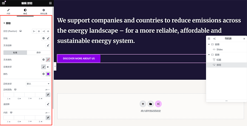
The "Style" tab of the Button widget contains several customizable settings, as shown in the image above. Compared to the Title widget discussed earlier, the Button widget offers more comprehensive style options, covering multiple key parameters to precisely adjust the button's visual appearance and interaction experience. Under the "Style" tab, the first setting is the positioning, which determines how the button is laid out within the container, such as centered, left-aligned, or right-aligned. The typography settings are similar to those of other components and are used to adjust the button text's font, font size, font weight, and other styles. The text color setting allows you to define the text color for both the standard state and the hover state, ensuring that the button remains readable and visually responsive in different states.
In addition, the border-radius controls the curvature of the button’s edges, which can be adjusted to create a square button, a rounded button, or even a completely circular button. The box-shadow effect can be used to add a shadow to the button, enhancing its three-dimensional appearance and making it more clickable. Finally, the padding setting determines the space between the button's internal text and its border. Adjusting this padding can optimize the button's size and overall visual balance. By combining these style settings, you can create a button design that is both visually appealing and user-friendly, tailored to the page’s design needs.
3、Products and Services Section
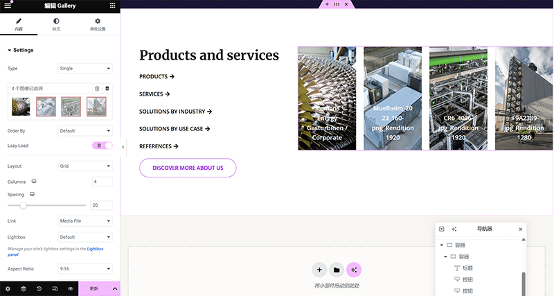
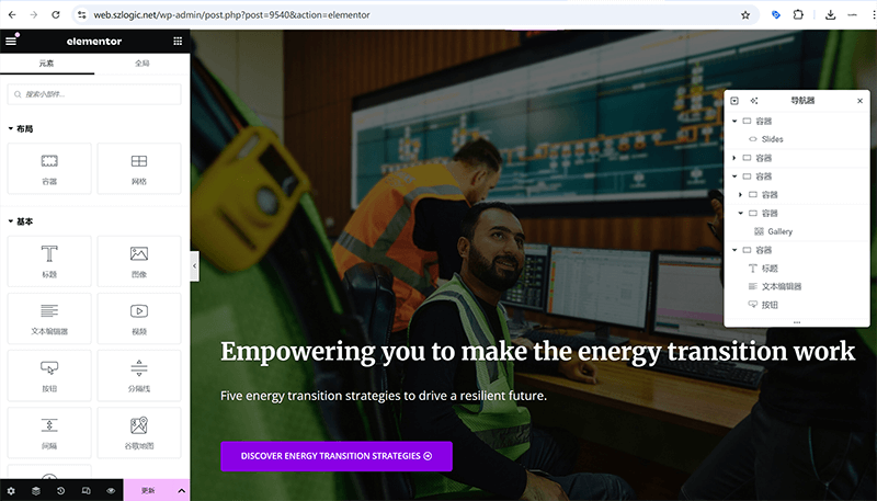
The container nesting structure of the Products and Services section is more complex compared to the previously discussed sections, with a richer hierarchy. As seen in the image above, the right-side child container uses the Gallery widget, which displays three images related to products or services, each image accompanied by text information to enhance visual expression and content explanation. On the left-side child container, the Title widget and multiple Button widgets are combined to achieve clear text guidance and interactive effects.
The Gallery widget offers various layout and parameter settings, as shown in the left-side settings area in the image above. You can adjust the image arrangement, number of columns, spacing, link format, and more. Currently, the Gallery widget is set to a 4-column layout with the Lazy Load feature enabled to improve page performance. The Title widget in the left-side child container is set with a large font size to ensure a striking visual effect. Below, multiple Button widgets are used to guide users to browse different product and service categories. The button color, border style, and text content can be further adjusted in the "Style" tab to ensure consistency with the overall design style. As previously explained in detail, the Title widget and Button widget's parameter settings and style adjustments have been covered. Next, we will focus on the Gallery widget, which has not been introduced in this section, and provide a detailed explanation of its parameter configuration and style adjustments to help you use this widget more flexibly for image display layouts.
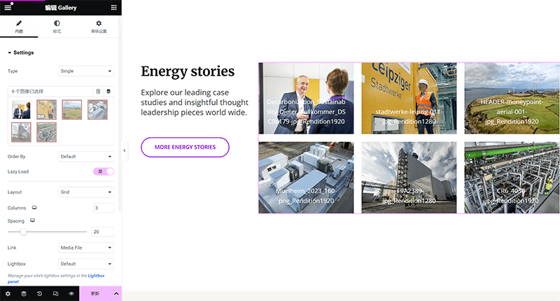
(1) Gallery Widget "Content" Tab Settings
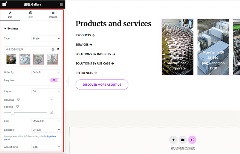
In the "Content" tab, the Gallery widget provides several core settings to help you flexibly configure the image display method. First, in the "Type" option, you can choose the display format of the gallery, such as Single or Grid, to meet different page layout needs. Next is the image selection area, where the currently added image list is displayed. Users can click the plus button to upload new images or remove unwanted ones. The "Order By" option is used to set the image sorting rule, such as sorting by default order or randomly. The "Lazy Load" option allows users to enable or disable the lazy loading feature, which can improve page performance, especially for galleries with a large number of images.
The "Layout" option determines the arrangement of the images. In the example shown above, the "Grid" layout is selected. The "Columns" setting defines the number of columns in the gallery, allowing you to adjust the image arrangement structure to fit different page widths. The "Spacing" option controls the gap between images, and users can adjust it using the slider to increase or decrease the spacing, optimizing the visual effect. In the "Link" option, users can set the click action for images in the gallery, such as linking to the media file so users can view the original image when clicked, or redirecting to a specific page. The "Lightbox" option allows users to enable a popup window to display images, providing a better browsing experience. Finally, the "Aspect Ratio" option controls the display proportion of the images. For example, the 9:16 aspect ratio set by the blogger here is to display the images in a columnar form. Through these settings, users can customize the gallery widget's display to fit different page design needs and enhance the website's visual appeal.
(2) Gallery Component "Style" Tab Settings
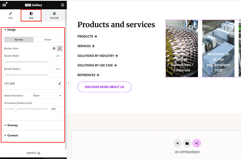
In the "Style" tab, the Gallery component provides several settings to allow users to customize the visual appearance of the gallery. Among them, the Image section enables users to adjust the border, corner radius, hover animation, and other styles to optimize the visual presentation. Under the Image settings, users can toggle between **Normal** and Hover states and set different styles for each. In the Normal state, users can adjust the Border Color , Border Width , and Border Radius to control the image border's appearance. Additionally, CSS filters are supported, allowing users to apply effects such as brightness, contrast, and saturation to the images, enhancing their visual depth.
In the Hover state, users can add different interactive effects to the images, such as Hover Animation , which supports various animation effects that make the image change dynamically when the mouse hovers over it. The Animation Duration option allows users to adjust the speed of the animation, ensuring that the animation's smoothness matches the user experience. Additionally, there are Overlay and Content options, which allow users to further customize the layering effect of the gallery and the text display on the images, helping to achieve more refined visual effects. With these settings, users can flexibly adjust the overall style of the gallery to align with the website's design style and interactive requirements.
4、Core Product Advantages Section
The product core advantage guide section uses the same components as the previously introduced "business description section," with the only difference being that this section’s container includes an additional background image element. This adjustment introduces a new concept, so in this section, I will explain how to add a background image to a container. For the settings and functionalities of the title component, text editor component, and button component, you can refer to the container layout and element component configuration in the "business description section" for practice and hands-on experience.
(1) How to Add a Background Image to a Container
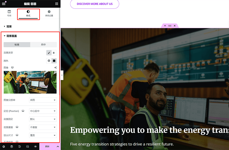
To add a background image to a container in Elementor, you need to go to the container's "Style" tab for related settings. First, select the container that requires a background image, and switch to the "Style" tab in the left settings panel. In this operation area, expand the "Background" section, where you will find the "Background Overlay" option. In the background type section, select the image option and either upload or choose the desired background image from the media library. Once the image is selected, you can further adjust how the image is displayed. First, the image resolution can either remain as the "original" or be adjusted according to your needs. Next, in the "Position" option, choose the appropriate alignment method, such as "center-center" to ensure the image is always centered. The "Background Attachment" option determines whether the background moves with the page scroll. If you want the background to remain fixed within the viewport, select the "Fixed" mode. For the "Background Repeat" setting, you can choose "No repeat" to prevent small images from tiling in the background. Additionally, in the "Size" option, selecting "Cover" will make the image fully fill the container without leaving any blank space. With these settings, users can precisely control the display effect of the container's background image to better match the page design requirements.
5. Brand Story Section
The container layout and the elements used in the Brand Story section are consistent with the previously described "Product and Business Section." It similarly uses three components: the Title component, Button component, and Gallery component to load the content, with the overall layout remaining as a parent container containing two child containers. Readers can apply the container parameter settings, nested arrangement methods, and the parameter and style adjustments of these three components learned earlier to achieve the layout design of the "Brand Story Section" as shown in the image above.
6、Latest Information Section
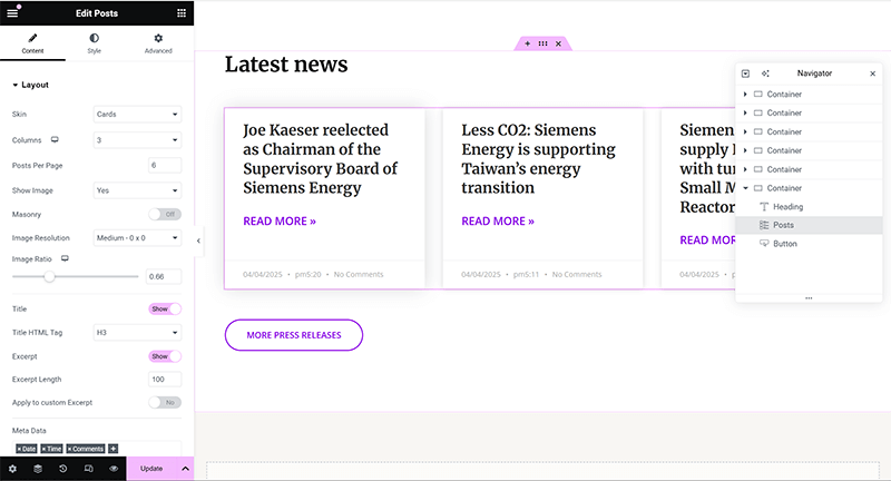
To display the metadata of Elementor's Post widget in English format on the page, you first need to change the site language of WordPress to English. This is because Elementor's editor interface and some metadata will default to the site's language and display accordingly. As shown in the screenshot above, the parameter and style settings of the Post widget will also switch to English. Next, the blogger will explain the core functionality settings and style adjustments for the Post widget, so that users can better apply this component.
(1) Settings under the "Content" tab of the Post widget
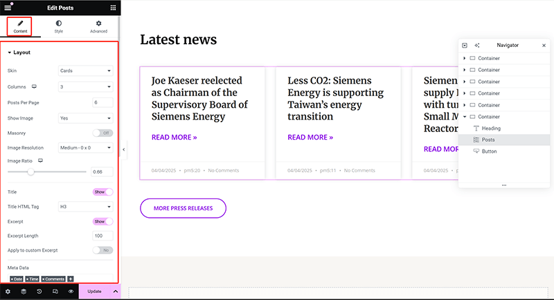
In Elementor's Post widget, the "Content" tab offers a range of key settings to control the layout and display of the article list. Here are the details of each setting function. Through these settings, users can flexibly adjust the content display of the Post widget to better align with the design style of the page:
- Layout: The layout section allows users to choose the display style of the posts. The "Skin" option is used to set the overall appearance style, such as the "Cards" mode, which arranges post content in card format. The next "Columns" option specifies the number of columns for the post list, while "Posts Per Page" determines how many posts are displayed per page.
- Image: The image-related settings include the "Show Image" toggle, which controls the display of the post thumbnail. The "Masonry" option enables a masonry layout, arranging images and post blocks at different heights to enhance visual effect. "Image Resolution" allows users to set the image resolution, such as "Medium 0.3x" to reduce image loading pressure, while "Image Ratio" is used to adjust the width and height ratio of the image to ensure the overall layout is balanced.
- Title: The title section provides the "Show" toggle, which decides whether the post title is displayed, and the "Title HTML Tag" option, allowing users to select an HTML tag, such as H3, which impacts SEO weight and style hierarchy.
- Excerpt: The excerpt section controls the display of post summaries. The "Show" toggle decides whether to display the excerpt, while "Excerpt Length" controls the character count of the excerpt to ensure a clean layout. Additionally, the "Apply to custom Excerpt" option allows users to apply the excerpt settings to custom content fields.
- Meta Data: The meta data section allows users to choose whether to display post information such as the date, time, categories, tags, and author, making the post list more complete and informative. In the screenshot, you can see that the date (Date), time (Time), and comments (Comments) have all been enabled.
(2) Post Component "Style" Tab Settings
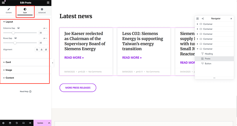
In the Elementor Post component, the "Style" tab offers a range of appearance adjustment options, covering overall layout, image styles, text styles, and spacing settings to ensure the visual presentation of the article list aligns with the website's design style. With these settings in the "Style" tab, users can fine-tune the visual appearance of the Post component, making it better match the website's brand style and overall design requirements. The details of the customizable styles under the Post component are as follows:
- Layout: The Layout section allows users to adjust the overall size of the Post component, including parameters for the width and height of the card. These settings help users optimize the placement of article blocks, ensuring they better fit different page layouts.
- Image: The Image section provides detailed style adjustments for the article thumbnail, including border radius, border, and shadow effects (Box Shadow). Users can adjust these parameters to give the image a variety of visual styles, such as square, rounded corners, or a more three-dimensional design.
- Content: The Content section involves style settings for the internal elements of the article, such as the title, excerpt, "Read More" button, and meta data. In the Title settings, users can adjust font size, color, weight, and spacing to make the title more distinct in the list. The Excerpt section also supports adjustments to font styles to ensure the readability and aesthetics of the article summary. Additionally, the Meta Data section allows customization of the font and color for information such as date, category, and tags, making the information hierarchy in the article list clearer.
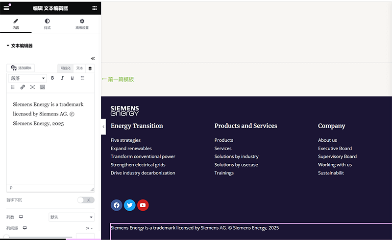
Ⅳ、Create a Footer Template File with Elementor
模板文件.png)
The footer section is the final demonstration of this article, explaining how to customize and create the layout and elements of a page. Once the footer layout and design are completed, the overall page structure is essentially formed, making it a complete page. The process for creating a footer template file is the same as for the header template file; both can be accessed through the Elementor Theme Builder interface in the frontend page. In the Theme Builder management interface, users can find the Footer option in the template directory on the left side, which is the second item in the directory. After clicking on it, you will enter the footer template management interface. In this interface, click the "Add New" button in the top-right corner to create a new footer template file. During the creation process, Elementor offers a variety of preset footer styles, allowing users to choose an applicable style to quickly complete the footer design. If a fully custom layout is needed, users can close the style selection window and use containers and element components to freely design a footer template that matches the website's style.
1、Common Layouts for Footer
Through the learning and hands-on practice in the previous section, readers should now understand that whether it's a simple or complex page layout, as long as we are proficient in using the parent container's parameter settings, arrangement direction, and the nesting method of child containers, any desired layout format can be achieved. The footer layout shown above is not particularly complex; it is generally implemented by nesting multiple child containers within a parent container, with the arrangement direction of the child containers determined by the design requirements. The footer layout demonstrated by the blogger is arranged in three rows, with the child containers placed in a specific order, and within the second-level child container, three sub-containers are nested in a column layout. Once the container layout is set, we can proceed to place the corresponding element components within the child containers.
2. Common Components for Footers
常用的组件.png)
The footer, as the bottom structure area of a website, is not as information-dense as the main body of the page or as navigation-driven as the header. However, it still serves very practical functions, such as displaying copyright information, contact details, social media links, secondary navigation, subscription forms, and more. In actual design, the complexity of the footer is typically determined by the overall style and functional requirements of the website. It can be very simple or relatively rich, depending on the needs. During the website-building process, the blogger has gradually developed an efficient and practical combination of footer components based on different project requirements. Although each website has its own positioning, by using these common components effectively, you can create a clear, aesthetically pleasing, and functional footer area without adding excessive fancy designs. In the following sections, the blogger will introduce the functional settings and styling configurations of these components, ensuring that their styles and designs align with the overall layout, so that even the details of your WordPress site reflect professionalism and quality.
(1) Site Logo Component
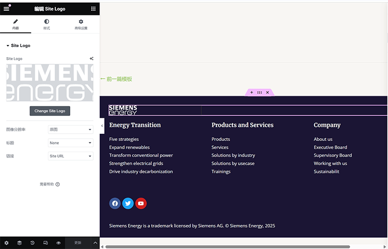
The Site Logo component was already used in the "Header Template File" section, but at that time, we mainly focused on the overall layout and the combination of components, without going into the details of the Site Logo component's functionality and style. Therefore, in this section, the blogger will provide additional explanations for the "Content" tab and the "Style" tab of this component, helping everyone gain a more flexible understanding of how to use it in different scenarios.
In the "Content" tab of the Site Logo component, users can choose whether to use the site logo set in the WordPress backend or upload a custom image as the logo. In addition to selecting the image, this panel also allows you to set the logo's link behavior (for example, whether clicking it will redirect to the homepage) and the image size of the logo (you can choose from default, thumbnail, medium, or other image sizes defined by WordPress). As for the "Style" tab, it provides more control options over the visual appearance of the logo. In this panel, you can customize the logo's width and maximum width to suit display requirements at different resolutions. You can also adjust the image's opacity and apply CSS filter effects (such as grayscale, brightness, contrast, etc.) to better align the logo with the overall page style. Additionally, the "Style" tab supports border settings, corner radius adjustments, and shadow effects, offering a more layered and dynamic display for the logo. These style adjustments not only enhance visual consistency but also ensure that the logo maintains optimal presentation across different devices and theme styles.
(2) Title component
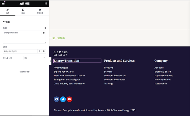
Apologies for the misunderstanding! Here’s the translation with the HTML code preserved: The functionality and styling settings for the Title component have already been explained in Chapter 3 of this article, in the section titled "Building the Page Structure and Adding Content Elements with Elementor" under the "Business Description Block" subsection. The blogger will not repeat the explanation here. You can practice using the Title component with the methods learned in the aforementioned section.
(3) Icon list component
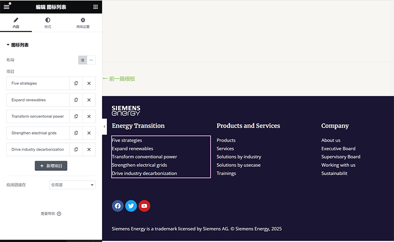
In Elementor's "Icon List Widget," the "Content" tab is primarily used to set the specific content and arrangement structure of each list item. You can add the content items that need to be displayed one by one and assign an icon to each item, such as a checkmark, arrow, phone icon, etc., to enhance the recognition of the information. Of course, as shown in the blogger's demonstration, you can also remove the icons from the list by simply deleting the current icon in the icon settings. Each list item can have a customizable title text and a corresponding link address set (for example, linking to another page or dialing a phone number).
In the "Style" tab, Elementor provides more personalized control over the appearance of the icon list. You can fine-tune the styles for both the icons and the text. For example, in the icon section, you can customize the icon's color, size, spacing, hover effects, and more; while in the text section, you can set properties such as font, font size, line height, color, and the spacing between the text and the icon. If the separator line feature is enabled, you can also adjust the thickness, color, and style of the line. Through these style options, you can make the icon list better align with the overall design style of the page, whether it's a simple design or a more visually striking creative page, allowing for flexible adaptation.
(4) Social Icon Component
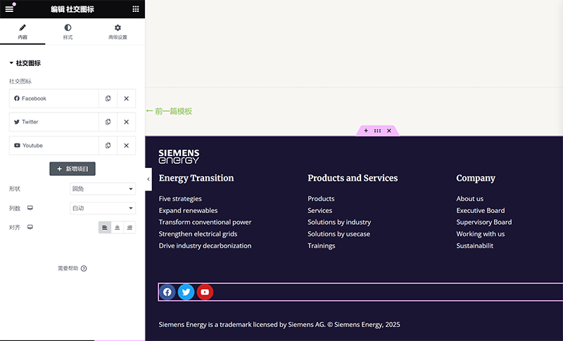
In Elementor's "Social Icons Widget," the "Content" tab is primarily used to add and manage links to different social platforms. Users can freely add multiple social icon entries based on their needs, such as the Facebook, Twitter, and YouTube icons used by the blogger in the image above. Each entry allows you to customize the icon type (you can use the built-in icon library or upload SVG icons), fill in the corresponding social link, and set whether the link should open in a new tab. In addition to the preset social platforms, you can also choose the "Custom" type to add any link and icon, offering more flexible use cases. Through these content settings, social icons not only quickly guide visitors to your other platforms but also visually strengthen the website’s external connectivity and brand integration.
In the "Style" tab, Elementor provides a rich set of visual customization options to ensure that social icons are both functional and aesthetically pleasing. You can set the icon size, spacing, alignment, and color scheme for the icons (such as official brand colors or custom colors). Additionally, this setting allows you to adjust the icon's border, corner radius, background color, and set hover effects, such as color inversion, scaling animations, or shadow changes, making the social icons more dynamic when users interact with them. With these style settings, whether you're designing a simple, flat-style footer social section or creating a visually prominent social guide area, Elementor's Social Icons Widget offers plenty of design flexibility.
(5) Text editor component
In Elementor's "Text Editor Widget," the "Content" tab is primarily responsible for entering text content and basic typography settings. Users can directly input the desired text sentences into the text editor. This component uses a WYSIWYG (What You See Is What You Get) editor, which functions similarly to the classic WordPress editor, supporting formatting actions like bold, italics, inserting hyperlinks, and adjusting alignment. If dynamic content (such as post titles, dates, etc.) needs to be inserted, it can also be achieved through Elementor's dynamic tags feature. Overall, the settings in this tab are more focused on content filling and structural presentation, making it suitable for displaying textual areas such as body paragraphs, introductions, copyright information, and other written content.
In the "Style" tab, you can customize the appearance of the text content. You can set the text color, font type, font size, font weight, line height, letter spacing and other layout parameters to adapt to the overall visual style of the page.
3. Publishing operation and display condition setting of Footer template file
The Footer template file is the same as the Header template file, which is a global part of the WordPress website. Therefore, the display conditions are set to display on all pages of the entire website, just like the Header template file. Readers can complete the publishing of the footer template file and the setting of the display conditions according to the instructions and options marked in the figure above.
4. Display of finished pages using the Elementor editor
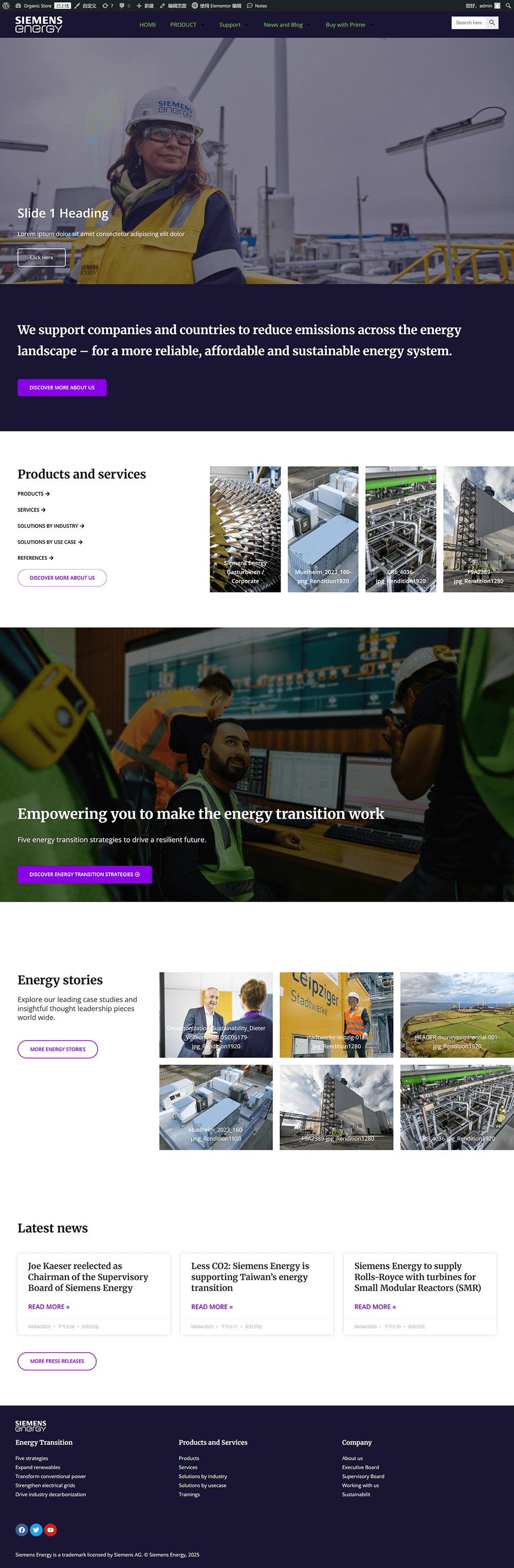
Conclusion: The complete page screenshot displayed above is the final result of the page that the blogger built while writing this tutorial, simultaneously demonstrating the process step by step. From creating a new page in the WordPress backend to using Elementor to create the header, main content, and footer elements and structures, every step and every setting was directly demonstrated based on the actual development process. It can be said that the final page result is a direct product of the content in this article. I hope this Elementor website-building tutorial, starting from scratch, provides clear references and practical tips for you as you learn WordPress page design and development. If you encounter issues during the process, feel free to revisit the corresponding chapters to check the details. If you've successfully completed the entire process, you're welcome to try adding more personalized designs on top of this foundation to continue expanding your own high-quality website pages.
Finally, if after reading this tutorial, you feel that building a WordPress website still requires professional technical assistance, or if you wish to elevate the Elementor page design to a higher level, feel free to learn more about and contact Logic Digital Technology Co., Ltd. We specialize in WordPress website design and custom development, with rich practical experience. We can create truly user-friendly and conversion-driven professional website pages tailored to your company's brand positioning and business needs. Whether it’s a corporate website, e-commerce platform, or multilingual foreign trade site, we can provide you with efficient, stable, and scalable website solutions.
This article is copyrighted by Logic Digital Technology (SZLOGIC) . Personal sharing and learning are welcome. Unauthorized use for any commercial purposes or reproduction of this article is strictly prohibited.