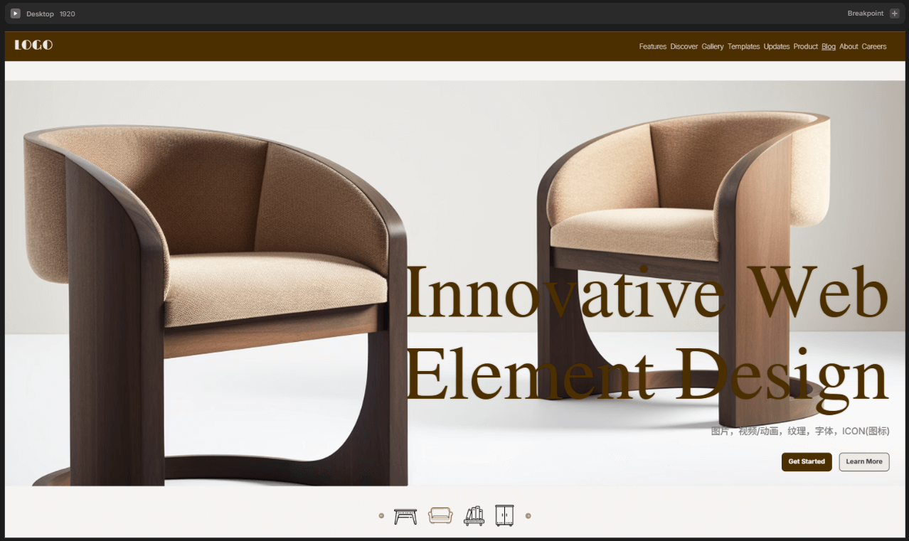
Web Design The Best Solutions for Balancing Visual Creativity and User Experience in 2025
In the digital age, an excellent web design is no longer just a display window for a company's image, but a visual extension of its brand essence. It not only carries the first impression of the enterprise but also communicates with users through graphic language, strengthening the brand's position in the user's mind. Web design is moving from a focus on "high-end and elegant" to a balance of "marketing practicality," becoming an important bridge that connects brand philosophy with user emotions. Especially in today's highly competitive internet marketing environment, design plays a role that goes beyond aesthetics, encompassing user experience, conversion efficiency, and operational effectiveness. In 2025, the development of web design trends is evolving towards a more strategic and integrated direction—visual creativity and user experience are no longer separate elements, but must be tightly integrated into a systematic design. Web designers need not only to understand user behavior and usage scenarios but also to skillfully integrate brand values into interface interactions to achieve deeper brand communication and business value conversion. In other words, the combination of visual aesthetics and functional experience is the key factor in driving the success of brand digitalization.
This article will comprehensively analyze how to create web works with commercial value and user appeal based on balancing creative expression and user experience, covering visual design, user experience, element creative design, and responsive design. To help readers quickly understand the structure of this article and read according to their needs, the author has specially organized the table of contents for the article "Web Design: The Best Approach to Balancing Visual Creativity and User Experience in 2025" as follows. The entire article is divided into four main sections, with the specific chapter arrangement shown below:
- Main Visual Design of Web Page
- Creative Element DesigCreative Element Design for Web Pagesn for Web Pages
- Image Element Design: Strategies and Techniques Behind Visual Focus
- ICON Design: Accent Visuals and Functions, Connecting Operations and Brand Key Points
- Video/Animation Design: Strengthening Visual Focus and Catalyzing Brand Narrative
- Font Design: Brand Emotion and User Guidance Behind the Line Language
- Texture Design
- Web User Experience Design (UI/UX)
- Responsive and Multi-Device Adaptation Design
Ⅰ、Main Visual Design of Web Page
The main visual design of a webpage forms the foundation of the website's overall style. It not only determines the visual presentation of the page but also profoundly influences users' first impressions of the brand or company and the browsing pace. Among these, layout design and color schemes are the core elements of the main webpage design. Together, they determine the organization of page content, the visual guidance path, and the overall sensory atmosphere. What we often refer to as "web design style" actually extends from these two aspects and is the most fundamental and crucial part of webpage design.
The layout structure determines the hierarchical relationship of information and the reading flow, while the color strategy directly affects the emotional expression of the page and brand perception. These two aspects not only reflect the aesthetic ability of the web designer but also test their understanding of the brand tone and user needs. In the design trends of 2025, website visuals not only need to catch the eye but also require clear information delivery and efficient visual guidance. This raises higher demands for the main webpage design. This chapter will focus on the key aspects of the main visual design of webpages, analyzing the evolution of page layout methods and the application of color trends, as well as the design logic behind popular styles, helping readers find a precise and expressive balance between creative expression and user experience when planning website page designs.
1、Web Layout Design: Efficient Implementation of Grid Systems
Web layout is the fundamental framework of the entire page design, determining how information is organized and how visuals guide the user. Regardless of the visual style of the webpage, it relies on a systematic and clear layout logic. The most widely adopted webpage layout method is the "grid-based layout system" — a design approach that constructs the page structure based on a grid logic. The biggest advantage of grid-based layout is that it provides alignment references and visual order for page elements, making the webpage appear neat and coordinated, while also giving web designers enough freedom to unleash their creativity. Under a unified grid framework, content modules such as text, images, buttons, and videos can be flexibly combined according to certain proportions, ensuring that different types of visual elements do not appear abrupt or chaotic.
(1) The Four Major Components of the Grid System
A complete webpage grid system typically consists of four core components: margins, columns, padding, and cross modules. These four components work together to divide the page into individual "content containers," helping web designers perform modular layout design.
Margin
Margin refers to the blank space between the content area of a webpage and the edges of the browser viewport. It not only determines the overall breathing space of the page but also directly affects the readability and focus of the content. In desktop design, the common margin range is between 100px and 300px. A margin that is too small will make the page feel crowded and increase reading strain, while a margin that is too large will compress the available space for content display. The specific value should be adjusted according to the website's style and content density. For example, websites with a minimalist style typically emphasize whitespace and visual focus, so their margins will be larger to enhance the sense of space. In contrast, industrial or data-intensive websites, which need to display more data tables and technical content, will have relatively tighter margins. On mobile devices, margin control is more refined, with common values of 24px, 32px, or 40px. This ensures that the content doesn’t stick to the edges while also considering the user-friendly nature of touch interactions.
Columns
Columns are the "main arteries" of webpage content, representing the vertically divided modules within the effective content area. They define the structural density and flexibility of the page. The typical number of columns ranges from 4 to 16. The more columns there are, the more flexible the layout becomes, but the design complexity also increases. A reasonable column division is crucial to ensuring visual rhythm, clear hierarchy, and readability of content.
- For mobile devices, 4 to 6 columns are commonly used to ensure simplicity and clarity.
- For tablets, 6 to 10 columns are suitable.
- For desktop devices, a 12-column system is often used due to its strong divisibility, making content combination easier. For example, 1 column, 2 columns, 3 columns, 4 columns, 6 columns, and 12 columns can all be perfectly adapted.
Padding
Padding refers to the blank space between adjacent columns, an important parameter in a layout system that defines the density of content. It not only maintains clear separation between modules but also prevents the page from appearing overly cramped. Appropriate padding enhances the breathing space of the content, making the page more organized and improving reading comfort.
- The minimum padding value for mobile devices is typically 16px, with increments suggested in units of 4 (e.g., 16px, 20px, 24px).
- For desktop devices, padding usually increments in units of 8px, with the exact values determined by the design rhythm and visual effect.
Cross Module
The cross-module refers to a design method that introduces horizontal segmentation on the basis of the traditional vertical grid. This design is less commonly applied in standard webpages, but in interfaces that require complex information partitioning and dense mixed text-and-image displays, such as backend system interfaces or data visualization pages, the cross-module can help organize information more clearly across both horizontal and vertical dimensions.
(2) The Core Value of the Grid System: Perceived Order Serving the User
The grid layout system, although a technical tool, has never been designed for the sake of design itself, but rather to serve the "perceived usability" of the user. A high-quality webpage is not built by piling up elements for show, but is based on clear information delivery and smooth browsing behavior. When web designers set margins, column numbers, and padding, the key considerations should always be: Is it easy for users to read? Is it easy to operate? Can they quickly understand the page structure? Therefore, the grid system does not have absolute standard values; it is a framework mindset and, more importantly, a layout philosophy that balances order and flexibility. In digital era web design, the grid system is no longer just the foundation of typography, but an important tool for enhancing user experience and reinforcing the professional feel of a brand.
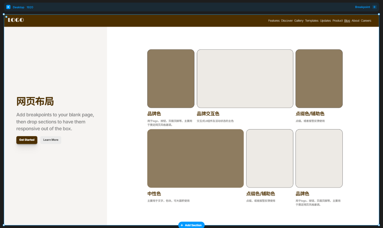
2、Web Color Scheme Design
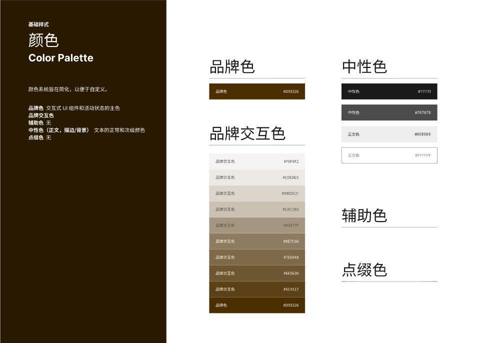
In web design, color is never merely an "aesthetic choice." Although it may seem subjective, there is actually a scientific logic behind web color schemes, rooted in the organic combination of user emotional cognition, brand visual identity system (VIS), and color psychology. Proper color selection not only shapes the atmosphere and tone of a page but also directly affects the user's visual comfort, behavior, and even determines the depth of the brand's impression in the user's mind. A web color scheme typically consists of four types of colors: primary, secondary, neutral, and accent colors. These four colors complement each other to form a complete visual order. By properly controlling the brightness, saturation, and contrast of the colors, the goal of "conveying the brand's tone + ensuring user readability" can be achieved.
(1) Primary Color: The Cornerstone of Brand Visual Identity and Recognition
The primary color carries the first impression of the website's overall visual appearance and is the main output of the brand tone and design style. It is widely used in elements such as the website's logo, header, footer, titles, buttons, icons, and more, appearing in almost every key position on the page. It is important to emphasize that the primary color is not a single color value but a systemized color combination, typically consisting of "brand color + brand interaction color."
Brand Color
You can use the company's existing VI primary color (such as the logo color) or customize it based on the brand's industry attributes and user emotional preferences. For example, in the skincare industry, where the target audience is mostly female, the primary color should be softer. It is recommended to use warm tones such as pink, off-white, or light purple. The color parameters can be controlled as follows: saturation 40%-60%, brightness 70%-90%, to convey a gentle, clean, and approachable visual emotion. If the brand emphasizes a "natural and organic" concept, you can also introduce natural colors like yellow, green, or brown in the hue to refine the style's recognition.
Brand Interaction Color
It is a color gradient derived from the brand color, generated by adjusting the brightness and saturation to create multiple levels of color values. These are used for hover effects, button feedback, icon graphics, decorative borders, and other interactive elements' visual presentation. This color system enhances brand consistency, particularly suitable for minimalist, high-tech, luxury, and other high-consistency design styles, and also reflects the current trend of systematic color matching in web design.
(2) Secondary Colors: The Supporting Cast That Enriches Visual Layers
The role of auxiliary colors is to enhance the sense of depth and richness in the page's colors. Under current website color trends, some styles of webpages require highly consistent color schemes, in which case the brand interaction color is also used as an auxiliary color. It is commonly used in functional modules such as charts, text and image blocks, prompts, background color blocks, etc. In styles such as artistic, playful, sporty, and friendly, auxiliary colors are often applied to convey theme vitality, fun, and information richness. Auxiliary colors mainly have two sources:
- Monochromatic auxiliary colors: These are consistent with the main color in hue, with adjustments made only in brightness or saturation. They are suitable for creating a harmonious and unified visual system.
- Contrasting auxiliary colors: These colors contrast with the main color in hue (such as blue vs. orange, green vs. red, etc.), used to enhance visual contrast and content segmentation, thereby increasing user browsing interest and content recognition efficiency.
(3) Neutral colors:Visual carriers for text and background
Neutral colors are the most often overlooked yet professionally challenging part of web design. They typically serve the visual function of basic elements such as page backgrounds, body text, and borders. When used appropriately, neutral colors can make a page both stable and refined, with a natural transition and clear layering. They are key to achieving "premium" and "immersive" design effects. Immersive web pages, futuristic interfaces, and dark-tech-style UIs are all examples of neutral color applications. Excellent use of neutral colors should follow these principles:
- Control the brightness in the range of 40% to 70% to avoid the image being too light or overly oppressive.
- Reduce the saturation to prevent the colors from appearing dirty or dull.
- Use gradients, lighting, textures, and transparency to enhance the richness and spatial feel of neutral colors.
- Choose grayscale tones with a specific inclination (such as cool gray or warm gray) to match the style atmosphere.
- When used extensively, control the contrast to avoid losing focus on the page.
(4) Accent colors:Visual guides that focus attention
The purpose of accent colors is to guide the user's attention, typically used in key positions such as clickable links, system prompts, and key action buttons. Accent colors need to have high contrast and high recognizability, with colors like red, orange, and bright blue frequently chosen as accent colors. However, it is important to note that the use of accent colors should be controlled in terms of quantity and frequency to avoid "color pollution" throughout the page, which could weaken their guiding effect.
(5) The key to website color matching is not abundance, but systemization
The essence of website color design is to systematically express the brand tone, guide user perception, and optimize the reading experience. It is not only about aesthetics but also about strategy. By scientifically setting the primary color, auxiliary colors, neutral colors, and accent colors, and dynamically combining them based on industry attributes, user characteristics, and page functionality, a color system that is both aesthetically pleasing and professionally expressive can be built. In 2025, website color matching is no longer just about "looking good," but is moving toward a unified direction of "user-friendly + brand accuracy + premium feel." Truly excellent website color matching is a visual language expression that starts from the brand and centers on user perception.
II. Creative Design of Web Elements
If there is any part of web design that tests creativity and imagination the most, it is undoubtedly the creative design of page elements and visual materials. Compared to the more structured page layout, the creative elements are more like the "finishing touch" — they require not only an aesthetic foundation but also a breakthrough in inspiration. Moreover, they must be highly integrated with the overall visual style to transform a webpage from "neat" to "stunning."
The so-called page elements include images, icons, fonts, animations, videos, background textures, and all other materials that make up the visual details of a page. These elements often determine whether a set of visual information is recognizable and attractive. A truly outstanding webpage is not merely a pile of color blocks and structures, but rather one that showcases uniqueness in the details — every icon, every decorative image, and the rhythm of every animation are bridges between brand philosophy and user experience. The web design trends of 2025 place more emphasis on the integration of materials and content. Web designers need to reinforce visual memory points and brand impressions while conveying information, making these creative elements not just "aesthetic decorations" but core components of website content expression. This chapter will focus on the creative expression strategies of key elements in web design and explore how they work in synergy with page structure to create an expressive visual experience.
1、Image Element Design: Strategies and Techniques Behind Visual Focus
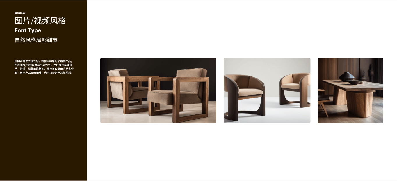
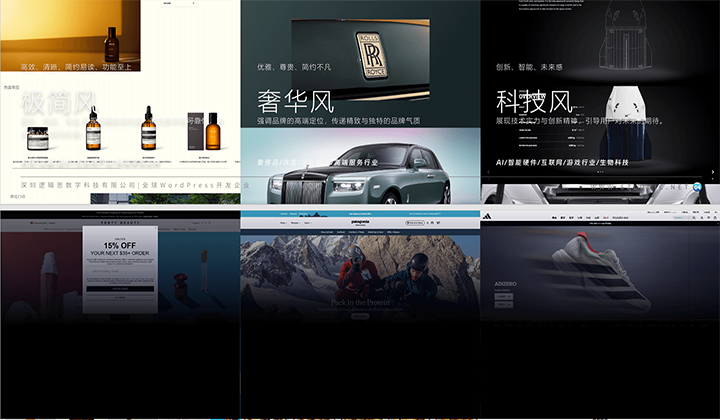
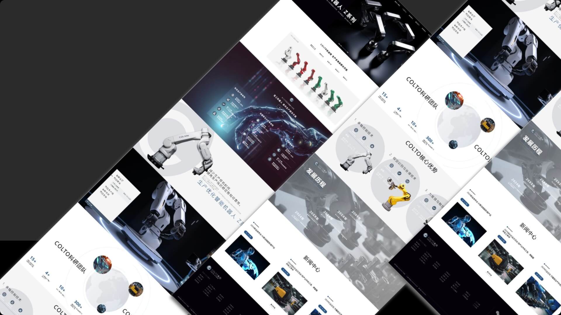
In today’s web environment, where information overload and limited user attention prevail, images have become the key visual elements that quickly convey brand value and product strength. Compared to text, images and videos are better at capturing users' initial attention and also occupy a significant visual weight on the page, playing a decisive role in the overall sense of design, professionalism, and brand perception. Excellent web image design must achieve three unities: unified style, unified tone, and consistent brand tone. This not only helps enhance the page's aesthetic appeal and professionalism but also strengthens brand recognition and trust. Even if a company does not have a dedicated brand design team, it can still systematically plan web image content in an organized way. Common types of images on a webpage can be divided into two core purposes:
- Product Display Images
- Company/Brand Strength Showcase Images
(1) Product Display Image Design: Building Visual Focus and Product Persuasiveness
Whether it's B2B, B2C, or a brand website, the core business revolves around the product. Therefore, the quality and presentation of product images directly affect user perception and conversion rates. Product display images can be divided into the following five categories, each with specific application scenarios and design focuses:
Product Images
Product images are used to showcase the basic form, structure, and appearance details of the product. They are commonly used on product pages, product modules, super menus, category menus, product detail articles, and more. It is recommended to use a white background for shooting to ensure flexibility in post-production for image extraction and compositing, enhancing future adaptability. The photography can be done either with a high-pixel camera or by hiring a small to medium-sized photography studio to ensure image clarity and proper composition.
Product Atmosphere Images / Concept Images
These images focus on conveying the brand's emotions and product tone. They are typically compositions of people and scenes, but can also be artistic concept images that represent abstract concepts such as "environmentally friendly," "intelligent," "warm," "premium," "portable," etc. Application scenarios include homepage banners, main product promotion modules on the homepage, product detail pages, brand introduction pages, article illustrations, and more. If the budget allows, it is recommended to hire a professional photography/design team. If resources are limited, these images can be created by combining product images with backgrounds. Logic Digital Technology can also provide visual production support for such images.
Product Scenario Images
The purpose is similar to that of atmosphere images, emphasizing the "application of the product in real-life/work environments," which can resonate with users. By specifically presenting the usage scenarios, it strengthens the connection between user needs and the product solution, improving conversion rates. These images are commonly used in key product display modules on the homepage, banner scene carousels, product detail pages, and more.
Product Breakdown Images / Function Explanation Images
These are commonly found on websites for technology, medical, mechanical, and digital products. They display the product's technical strength and core selling points through forms such as structural cross-sections, disassembly processes, and component function diagrams. These images emphasize professionalism and are often used in technical specification modules, product detail images, product introduction articles, etc. They help build user trust and product authority.
(2) Brand Strength Images Design: Building Trust and Professional Image
Images that showcase company and brand strength are particularly important for B2B websites and brand websites. They not only convey corporate culture and professional image but also enhance user trust, making them especially suitable for use on pages such as "About Us," "Brand Story," "Investor Relations," and more.
- Company Real-Scene Images: Display office environments, production workshops, meeting sites, employee daily activities, etc., to reflect the company's actual existence and operational scale, enhancing corporate transparency and trust.
- R&D and Qualification Images: Suitable for companies focused on innovation and technology, such as those in the fields of technology, biology, and healthcare. The content of these images can include laboratories, R&D teams, test reports, research equipment, patent certificates, and more. These images directly reflect the company's competitive barriers within the industry, and it is recommended to combine text and images during layout to enhance authority.
2、ICON Design: Accent Visuals and Functions, Connecting Operations and Brand Key Points
设计.png)
In web visual composition, an ICON is a very small yet far-reaching design element. It not only plays a role in visual guidance and functional identification but also serves as the "point" in the "point, line, and surface" layout logic, giving the entire page a sense of rhythm and breath. Compared to images and text, which are "surface" or "line" information carriers, an ICON is more like a punctuation mark in web design. It is the graphical representation of functional instructions and an extension of the brand's visual assets. A well-structured and consistent ICON system can enhance user experience while strengthening the professionalism and recognizability of the webpage.
(1) Basic Classification and Design Points of ICONs
Based on different usage scenarios and functional roles, ICONs on webpages can generally be divided into four categories. Each category has different considerations in terms of style consistency, interaction logic, and design techniques.
Functional ICONs: Simple and Clear, Prioritizing Recognizability and Operability
Functional ICONs are the most common type on webpages, primarily used for navigation instructions (such as menu, back, search), action buttons (such as add, delete, download), and status feedback (such as loading, success, failure) in interactive scenarios. The core design focus of these icons is "recognizability" and "simplicity."
- The graphics should align as much as possible with users' cognitive habits. For example, a magnifying glass represents "search," and three horizontal lines represent "menu."
- Try to use geometric shapes with minimal details to ensure clarity and visibility at small sizes.
- You can use linear icons (line icon) or flat icons (flat icon) styles, depending on the overall style of the webpage.
- To enhance the interactive experience, it is recommended to use SVG format, which is beneficial for responsive scaling and hover animation effects.
🎉Operational Recommendation: When building a functional ICON library, ensure consistent sizes (such as 24px or 32px as standard benchmarks), and maintain uniform line thickness and corner radius proportions. During development, avoid mixing different icon styles, especially within the same operational area.
Brand-related ICONs: Visual Extension of Identity and Systematic Design
Brand-related ICONs mainly include company logos, product sub-brand logos, service category icons, etc., used to enhance brand recognition and improve the visual system. In actual pages, these ICONs not only represent the brand identity but are also commonly embedded in modules such as navigation categories, menu cards, and brand introduction pages as visual auxiliary symbols.
- Graphic design should strictly follow the brand's VI system, including colors, fonts, and style shapes.
- If multiple product lines or service subcategories are involved, it is recommended to design a unified "combined icon system" to maintain overall style consistency.
- A unified enclosing shape (such as circle, rounded square) can be used to enhance the overall sense of order in the combined icons.
🎉Operation Suggestions: Use a grid system to design icons (such as an 8pt grid) to ensure clear presentation on different devices. For colors, it is recommended to use the brand's primary color + neutral colors, maintaining recognition while not interfering with the main visual of the page.
Decorative ICONs: Supplementary Graphics to Enhance Technological Feel and Visual Depth
These icons are commonly seen on websites in industries such as technology, artificial intelligence, finance, and healthcare, used to express abstract concepts like "intelligent recognition," "digital encryption," "medical testing," etc. While they are not highly functional, decorative ICONs emphasize visual perception and the futuristic expression of the page.
- Common forms include 2.5D icons, 3D skeuomorphic icons, micro-animated ICONs, glassmorphism ICONs, etc.
- They are mainly used in areas such as Banner regions, homepage first screens, technology explanation modules, product feature display pages, etc.
- They can be paired with gradient colors, shadows, animations, frosted glass effects, etc., to enhance the technological or futuristic feel.
🎉Operation Suggestions: Decorative ICONs should be used with caution. They should serve as visual enhancements rather than the main information carriers, avoiding excessive complexity that could impact load speed. It is recommended to use Lottie JSON animations or SVG animation control components exported from AE to optimize performance.
Social/External Link ICONs: Small but Crucial User Path Conversion Guidance
Social media ICONs and third-party platform external link ICONs (such as Weibo, Little Red Book, WhatsApp, Shopee, Amazon, etc.) are small in size but play an important role in website operation, communication, and conversion. They are commonly found in areas such as the footer, product detail pages, sharing components, and user centers.
- The icons can directly use common standard ICONs (such as Font Awesome, Simple Icons, etc.) or obtain the SVG versions from the official website.
- It is recommended to unify borders, colors, or hover effects in terms of style to maintain consistency in the overall design.
🎉Operation Suggestions: Social media icons do not need to be redesigned, but it is recommended that web designers enhance the overall feel of the page by adding a unified background, border, and rounded corners. Try to use vector icons as much as possible to ensure high-definition output and compatibility.
(2) Systematic Strategy for ICON Design
To build a high-quality ICON system, visual design alone is not enough. It also requires unified planning from three dimensions: "style consistency, technical implementation, and user usage habits":
- Unified Style System: This includes color, line thickness, corner treatment, icon fill rules, etc., applicable to all types of ICONs, creating visual consistency.
- Responsive Adaptation: Ensure that ICONs maintain clarity across different resolutions. Sizes should be designed in increments from 16px, 24px, 32px, and adapted to multiple devices.
- Animation Value-Added Design: Add hover effects, click feedback, and micro-interaction animations to commonly used ICONs to enhance the page's interactive experience.
- File Format Specifications: Prefer SVG vector graphics (which are compressible). For highly interactive animated ICONs, use Lottie format to improve loading efficiency.
3、Video/Animation Design: Strengthening Visual Focus and Catalyzing Brand Narrative
In web design, videos and animations are no longer just background decorations; they have become important tools for driving user engagement and conveying brand stories. Like images, their core purpose is to "showcase product value" or "demonstrate corporate strength," but as dynamic media, videos have a stronger ability to carry information. They are particularly well-suited for conveying abstract concepts, emotional atmospheres, and high-tech scenarios.
(1) Strategic application of video content: focusing on visual focus and emotional communication
As a heavyweight visual element on a web page, videos are generally not used for large-scale repetition. Instead, they are precisely placed at key sight positions after users enter the page, especially:
- Homepage Banner Area: Often used for brand display, product teasers, or main event promotion, it reinforces the first impression and enhances visual impact. Videos are recommended to be kept under 10 seconds, emphasizing a "fast pace + strong rhythm" to capture attention and quickly convey core content.
- Product Detail Page Dynamic Demonstration Module: For products that require operation instructions or technical demonstrations (such as electronic devices, software tools, or manufacturing processes), videos are more persuasive than images and help increase user trust.
- Company Introduction and Brand Story Section: Using interview-style videos, vlog-style storylines, or drone footage of the company environment, strengthen the company's strength and cultural atmosphere, enhancing brand affinity.
🎉Notes: Due to the large file size of videos, to avoid slowing down page loading speed, video files should be properly compressed and hosted on professional video platforms (such as Vimeo, YouTube), and then embedded using iframe or API.
(2) Scene application of animation design: transition from decoration to functional guidance
Unlike videos, web animations are not only decorative, but also carry interactive functions such as "guidance", "prompts" and "feedback". In the current web interactive experience, the addition of micro-motion effects has become an irreversible trend, especially in the following aspects:
- Page Load Animation: Optimizes the waiting experience and alleviates user anxiety, commonly presented in the form of dynamic brand logos, loading progress bars, spinning animations, etc.
- Page Scroll Animation: As the user scrolls down the page, content modules are sequentially displayed through fading in, sliding, zooming, etc., enhancing the reading rhythm and immersive experience.
- Button/ICON Micro-Interaction: Small feedbacks (such as slight enlargements, color changes, icon rotations, etc.) upon mouse hover or click, not only increase the "vibrancy" of the page but also enhance the sense of interaction between users and the interface.
- Data Visualization Animation: When presenting company data, development history, market share, etc., dynamic charts gradually drawn can enhance the fun and professionalism of information delivery.
4、Font Design: Brand Emotion and User Guidance Behind the Line Language
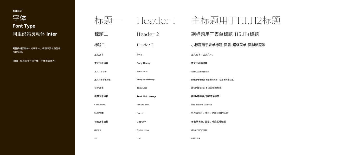
In web design, fonts are more than just containers for text. As a core element at the visual level, they are not only responsible for the transmission of information, but also for the presentation of the page's temperament and the construction of the brand impression. A font system with a unified style and clear hierarchy can often convey professionalism and trust to visitors at the first time. Font design is essentially a "reconstruction of the aesthetics of a collection of lines". As long as the three core points of font selection, hierarchical arrangement and visual unity are grasped, the overall look and feel of the web page will rise to a higher dimension.
(1) Choose the right font: understand the emotions behind the lines
The choice of fonts is not a random combination, but should be based on brand positioning and user emotions. In design psychology, different line shapes themselves contain emotional cues, and fonts are composed of these lines:
- Fonts made of straight lines: Such as sans-serif fonts (Helvetica, PingFang, etc.), conveying a rational, professional, and stable atmosphere, suitable for tech, finance, and B2B brands.
- Fonts with diagonal lines: These have a stronger sense of dynamism and modernity, suitable for sports, fashion, or emerging brands, emphasizing speed and trendiness.
- Soft curved fonts: Such as some rounded or decorative serif fonts, presenting a warm, friendly, and lifestyle-oriented feel, better suited for beauty, e-commerce, and home decor brands.
- Bold fonts: Conveying strength, emphasis, and authority, suitable for titles or visual accents during brand emphasis phases.
- Thin fonts: Conveying elegance, high-end, and restrained qualities, used in brand subheadings, functional descriptions, annotations, etc., helping to enhance the "white space" and breathing room on a page.
🎉Action Advice: When selecting fonts, try to limit to 2-3 types and prioritize using web-safe fonts or fonts optimized for Chinese webpages (such as Source Han Sans, Alibaba PuHuiTi), to avoid page delays caused by loading font files.
(2) Font hierarchy design: using “contrast” and “proximity” to organize page rhythm
In modern web pages, the visual organization of text is equally important. Good hierarchical logic can help users quickly grasp key information and improve browsing efficiency.
- Proximity Principle: Group related text with similar functions or content, and establish a visual "block" structure by controlling the spacing, making the content more organized. For example: title + subtitle + body text + tags + supplementary explanation, which should be layered and maintain rhythm.
- Contrast Principle: Use visual variables such as font size, color depth, weight, letter spacing, line spacing, and structure to create a hierarchical relationship. For example, the page title should be prominent enough (suggested size: 18pt or above, bold, solid color or brand color), body text should remain readable (14-16pt, regular weight), and explanatory text can be slightly faded or reduced in size.
🎉Action Advice: It is recommended to pre-set a font hierarchy system in web design tools (such as Figma, Sketch), and mark different style levels such as title, subtitle, body text, and explanatory text, then uniformly apply them using a Typographic Scale.
(3) Unify fonts at the same level: create an orderly visual rhythm
Unifying the font styles at the same level is the key to ensuring that a web page is "neat, beautiful, and professional." Web pages have a lot of information and users can more easily identify content types through visual repetition, which enhances reading efficiency.
- Visual Consistency: Content of the same level (such as all level-one headings, product names, button text, etc.) must have unified font, size, color, and weight. This not only enhances aesthetics but also establishes the user's reading habits and expectations.
- Brand Identity Continuity: Font style is also part of brand identity and should be consistent across various platforms such as websites, promotional materials, and social media, to strengthen the brand image.
🎉Action Advice: Font styles can be unified and managed through CSS properties (–font-primary, –font-heading, etc.) or frontend design systems such as Tailwind and Ant Design, making it easier for team collaboration and maintenance.
5、Texture Design
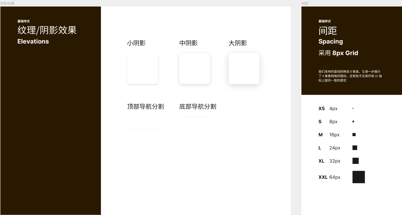
In web design, textures may not be the main element, but they are one of the key details that determine the visual feel of a page. Unlike images or videos, which capture the visual focus, textures subtly inject a sense of sophistication and artistic atmosphere into the page style. Especially when applied over large solid-colored backgrounds, appropriately layered textures with tactile quality not only break the monotony of the page but also enhance the visual depth and richness of the overall composition. From a design theory perspective, the core of web layout is the arrangement and organization of "points, lines, and planes." Text is a linear element, images and backgrounds mostly constitute planes, while textures are decorative details that fall between points and lines. Adding textures with a sense of lines, texture, gradients, or material quality in a webpage can effectively guide users’ visual flow, create an atmosphere, and help the brand convey a specific tone. For example, textures with a slight paper feel can create a retro and cultural atmosphere; metallic textures are more suitable for technology and high-end brands, strengthening the "high-precision" impression of the product. In terms of practical application, the following two principles should be followed when designing textures:
(1) Textures must have a clear visual purpose
Before adding texture elements, web designers must clearly define whether this action positively contributes to the overall style of the page. Is it intended to enhance the sense of depth? Or to strengthen the brand personality? Or to fill the emptiness created by solid colors? If the texture does not bring these positive effects to the page, it could become a distraction. For example, adding complex textures to a minimalist webpage can easily break the overall sense and freshness of the design.
(2) Less is more, and refined white space is the key to sophistication
The use of textures should be "restrained," as less is more. In the era of information overload, users are bombarded with hundreds or even thousands of visual stimuli daily. The primary task of a webpage is not to be "noisy," but to effectively convey information. Therefore, textures should be just a subtle accent in the visual rhythm, not the main focus. For example, using a slight noise texture in a section or adding a subtle embossing effect on a button hover state can enrich the webpage details without overwhelming the design. Additionally, texture design should pay attention to the balance of technical presentation. High-resolution texture images may affect webpage loading speed, so it's recommended to use SVG, CSS pseudo-classes, or lightweight WebGL dynamic textures as alternatives. This approach not only maintains aesthetics but also ensures good performance.
Ⅲ、Web User Experience Design (UI/UX)
Web user experience design typically covers both UI (User Interface) and UX (User Experience), with the core goal of optimizing the operational flow and sensory experience in every interaction between the user and the website. From clicking buttons to reading information, from page load speed to content feedback mechanisms, all design decisions should be based on the real needs of the user. High-quality user experience not only improves the usability of a website but also directly affects user engagement time, bookmarking behavior, revisit frequency, and conversion rates. In the process of digital brand communication, user experience design is gradually becoming a key factor in capturing users' minds and building brand loyalty. Therefore, a webpage is no longer just a carrier of information; it is also a channel for emotional communication and a tool for guiding behavior.
Since user experience is centered around the "user," web designers must have the ability to think from the user's perspective. When designing each interaction, it is essential to consider the user's operating habits and psychological expectations in a given context. This is the prerequisite for good UI/UX design. It not only requires web designers to be proficient in web structure, interface construction, and interaction logic, but also to reassess every detail from the user's point of view—Is the navigation clear? Is the process smooth? Is the visual design distracting? All of these details contribute to the overall perception of the user experience. This chapter will explore key design principles for web user experience, diving into the latest trends in UI interface optimization, interaction logic design, and accessibility strategies, helping designers create websites that are not only visually appealing but also truly user-friendly, pleasant, and conducive to repeat visits.
1、Navigation Design
In web user experience design, navigation design is one of the core structural elements. It not only directly affects the user's browsing efficiency and path choices on the website, but also determines whether users can quickly find the information they need, thereby influencing overall site satisfaction and conversion rates. The essence of navigation is to provide clear path guidance for the entire website's content structure. Whether jumping to internal pages, triggering functional modules, or linking to external resources, every detail of the navigation system—from menu hierarchy, layout form, and interaction feedback to the visual style design—should be closely aligned with user behavior habits and brand positioning in order to truly enhance the user experience.
(1) Core Operational Principles of Navigation Design
At the operational level, excellent navigation design should follow these three core principles:
Visual Style Consistent with Brand Tone
As one of the global elements in a webpage, the style design of the navigation must integrate into the overall brand visual system. For example, tech brands tend to use minimalist linear-style navigation icons combined with dark or neon color schemes to enhance a cutting-edge feel. High-end luxury brands, on the other hand, are better suited to detailed, elegant fonts with soft animations to reflect texture and sophistication.
Clear Interaction Feedback, Clear Operations
Whether it's mouse hover, clicking to pop up a submenu, or swiping to expand on mobile, every interaction in the navigation should provide clear feedback to the user. For instance, color changes, button highlighting, and transition animations can effectively enhance the user's perception and confidence in navigation operations, improving the coherence of the experience.
Rational Structure, Clear Hierarchy
The ultimate goal of navigation is to help users "quickly find the target content." Therefore, the classification logic of navigation content must be clear, and the information hierarchy should not be too deep, avoiding users from clicking multiple times or losing their way when searching for a specific page.
(2) Common Types of Navigation Menus and Their Usage Scenarios
To meet the needs of different web structures and content volumes, navigation menus can be designed in various styles. Below are some mainstream navigation types and their operational descriptions:
Popup Navigation Menu
This is suitable for websites with concise content and a small number of pages, such as brand websites or event pages. When the navigation button is clicked, a small menu pops up, typically displaying a few options in a vertical or horizontal list format. It is fast-loading and simple in structure. This type is commonly used on mobile devices or minimalist style websites.
Mega Menu
This is a common choice for large websites with complex content categorization, such as e-commerce platforms or portal websites. A mega menu typically expands into a large panel when hovering over or clicking on the main navigation, and it can accommodate multiple columns, icons, and text-and-image combination blocks. It supports second-level and even third-level directories. The key to its design is proper categorization to avoid information overload, which could lead to users becoming lost.
Full-Screen Navigation
Full-screen navigation is particularly suitable for mobile and tablet scenarios. When the user clicks on the navigation button (usually a hamburger icon), the page switches to a full-screen menu mode. The content is typically arranged vertically, supporting both text and images, enhancing visual guidance. The advantage is that the information is clear, and touch operations are user-friendly. The disadvantage is that it can interrupt the browsing flow, making it more suitable for brand websites where visual design is the focus.
Sidebar Navigation
Sidebar navigation is commonly divided into two forms:
- Left/Right Fixed Menu: Similar to the vertical arrangement of the mega menu, this is suitable for backend management systems or function-intensive sites, emphasizing module-switching efficiency.
- Anchor-based Sidebar Navigation: When the page content is long, such as on product detail pages or lengthy article pages, anchor navigation can be added to the side of the page, enabling a "one-click jump to a specific section" function, which enhances the readability and navigation efficiency of long pages.
Anchor Navigation Bar (Top/Partial)
Suitable for single-page websites (Landing Page) or content-heavy pages. Typically presented as a fixed top navigation bar, where clicking on a menu item will jump to a specific section within the same page. The advantage of anchor navigation is that it improves the navigability of single pages, while also helping to focus on key content, increasing user engagement.
(3) Customized Navigation Strategy: Innovation in Experience, Not in Flashiness
In addition to the common navigation types mentioned above, as brand styles and user needs diversify, more and more websites are opting for "custom navigation experiences." Examples include scroll-follow navigation (Sticky Nav), multi-page integrated sliding switch navigation, gesture-controlled menus, and bottom disc navigation. These innovations all aim to enhance the user experience without compromising "information accessibility." It is important to note that the ultimate goal of navigation is to provide users with a "convenient, clear, and fast" path selection, rather than simply pursuing visually impressive features. Regardless of which navigation method is used, it must focus on the user's operation experience itself, avoiding flashy yet impractical interactive traps.
2. Interaction Design
(1) Button Interaction
In web user experience design, button interactions are considered a key module that exemplifies "big impact from small elements." Although the space occupied by a button on a page may not be large, the operational significance it carries is extremely important. Buttons are not only direct tools for guiding user behavior but also high-frequency interaction points that drive business conversion, enhance operational efficiency, and optimize visual flow.
Three Main Types of Button Functions and Design Guidelines
To more precisely plan interaction logic and design style, web buttons are typically categorized into three types based on page hierarchy and interaction goals: Conversion-Driving Buttons, Functional Buttons, and Interface Interaction Buttons. Each type of button has its own optimization logic in terms of visual hierarchy, functional feedback, and design standards.
① Conversion-Driving Buttons (CTA Buttons)
CTA (Call To Action) buttons are the highest level buttons on a webpage and directly drive business results. Their primary goal is to encourage users to perform key actions, such as purchasing products, submitting inquiries, initiating online consultations, registering accounts, booking services, and more. Since they are directly tied to user conversions, they must adhere to the following design principles:
- Highlight Visibility: The color, size, and font should be distinct from other elements on the page. High-saturation colors (such as orange, blue, or red) can be used, combined with appropriate white space to create visual focus.
- Complete State Feedback: The button should have different visual states, including normal state, hover state, click feedback, loading state, and error messages, ensuring that user interactions are clear and controllable.
- Precise and Action-Oriented Naming: Button labels should use verb-driven language, such as "Buy Now," "Free Trial," or "Quick Register," so users clearly understand the action they will take after clicking.
- Logical Interaction Path: Typically, clicking the button should lead to a new page or the start of a business process. Errors such as no feedback or logical breaks should be avoided.
🎉Design Tip: It is recommended to focus on 1-2 CTA buttons per page to avoid overwhelming the user’s decision-making process.
② Functional Buttons
Functional buttons are often used in interfaces with clear operational goals, such as form interactions, filtering modules, and toolbars. The interactions of these buttons are typically completed within the current page and are accompanied by specific functional actions, such as submitting a form, uploading files, generating reports, or expanding filters. The design considerations for these buttons should include:
- Icon + Text Combination to Enhance Recognition: For example, a "Search" button combined with a magnifying glass icon, or an "Upload" button paired with a cloud icon, allows users to quickly understand the intent of the button.
- Clear Execution Feedback: After completing the functional operation, the system should provide immediate status feedback, such as showing a "Submission Successful" message after submitting a form, or displaying a loading animation after filtering is completed.
- Button State Control: The button should be in a clickable state before the action, and set to a loading state during execution to prevent duplicate submissions or user confusion.
- Logical Button Placement: Functional buttons should be placed near their target areas, for example, the "Submit" button should be located at the bottom of the form, and the "Filter" button should be near the filtering section, ensuring that the operation path is intuitive and easy to use.
③ Interface Interaction Buttons
Interface interaction buttons are primarily used to control the switching of components or visual states within a page, such as opening pop-ups, expanding or collapsing content, switching module views, and navigating carousels. These buttons do not involve backend data requests; all operations occur on the frontend visual layer, with a greater emphasis on the "behavioral expressiveness" of the user interface. Common use cases and design recommendations include:
- Carousel Navigation Arrows: Use simple icon buttons to control left and right sliding, with micro animations on hover to indicate the current interactive state.
- FAQ Expand/Collapse Button: Typically represented by "+" and "–" symbols or "down/up arrow" icons, indicating that the content is controllable, with clear state changes when toggled.
- Pop-up Toggle Button: Should have animated transitions to avoid abrupt changes. The close button is commonly located in the top-right corner and should have an enlarged clickable area for ease of use.
- Component View Toggle Button: For switching between list and card views, use icon-based toggles with slight zoom or color changes to indicate the current state.
🎉Design Tip: Although interface interaction buttons do not trigger business operations, their smooth interaction directly affects user dwell time and satisfaction. Therefore, it is essential to pay high attention to the "immediate response" of animations and visual feedback.
Button Interaction Design Unified Guidelines
To enhance overall UI consistency, it is recommended to establish unified button design standards across the entire website, including:
- Uniform Button Size and Corner Radius Style: Use the same style of buttons across different page levels for a more organized and professional visual.
- Clear Categorization of Color System: CTA buttons, functional buttons, and danger operation buttons (such as delete, close) should use different color schemes to minimize misoperations.
- Responsive Design Compatibility: Buttons should adapt to different terminal screen sizes (PC, mobile, tablet).
- Subtle and Appropriate Interactive Effects: Avoid excessive and redundant animations. Prioritize lightweight interactions such as opacity changes and scaling for natural transitions.
(2) Form Interaction
Form interaction is one of the most functionally deep interaction modules in web design. It is not just an input interface but a critical bridge through which users establish data connections, initiate behavior requests, and complete business processes with the website. Especially when it comes to operations such as information submission, filter searches, placing orders, and making payments, the quality of the form experience directly affects user conversion intentions and satisfaction. From an interaction perspective, form design takes into account three major dimensions: visual presentation, operation process, and data structure. However, this section will focus on visual and frontend interaction design, discussing how to improve the usability and experience of forms through frontend interaction techniques without altering business logic and backend processing.
Simplicity and Efficiency as Core Design Principles
A high-quality form’s primary requirement is to avoid "information overload" and "input fatigue." Especially with the trend toward mobile browsing and fragmented reading, form design should aim to be "concise, clear, and quick to complete."
- Field Simplification: Only retain the most necessary options and remove redundant fields. There should be clear visual differentiation between "mandatory" and "optional" fields.
- Information Grouping: Place logically related fields together to form "visual blocks," enhancing reading efficiency.
- Multi-Step Flow: For forms with many fields, guide users to fill them out step-by-step to reduce mental load.
- Unified Labeling: Elements of the same type (e.g., input boxes, drop-down lists, radio buttons) should have consistent borders, fonts, and spacing to maintain a neat and standardized interface.
Common Form Types and Interaction Design Suggestion
Depending on their functional purposes, common forms can be divided into the following four categories, each with different interaction methods and design priorities:
① Information Collection Forms
This type of form is primarily used to gather basic user information, feedback on needs, or interactive messages. Common scenarios include account registration, login verification, online appointments, contact forms, and submitting comments. The design key points for this type of form are as follows:
- Clear Input Hints: Use placeholders or labels to explain the field’s purpose, avoiding the need for users to guess.
- Instant Feedback Mechanism: Provide immediate error prompts when there is an incorrect format (e.g., email format error) to avoid prompting errors only after a repeat submission.
- Friendly Form Validation: The input validation process should be as non-intrusive as possible, with error messages close to the corresponding field and with clear semantics.
- Clear Call-to-Action Buttons: The submit button should be designed with high visual prominence, differentiating it from other buttons on the page. The wording should guide users with verbs like "Submit Application" or "Send Message."
② Transaction Forms
Transaction forms are primarily used on B2C websites or service platforms, with the core purpose of guiding users through a series of steps from product selection to payment and checkout. The key design points for this type of form are as follows:
- Step-by-Step Process Logic Clarity: For example, "Select Product > Fill in Information > Confirm Order > Complete Payment." Each step should be clearly marked on the page.
- Clear Form Field Structure: Use two-column or multi-column layouts to organize fields. For instance, the "shipping address" can be broken down into smaller field modules such as province, city, district, street, and postal code.
- Security Visual Cues: When dealing with payment or sensitive information, include design elements such as lock icons and instructional text to enhance trust.
- Clear Feedback for Form Submission Button: After clicking "Pay," immediate feedback should be displayed to avoid multiple clicks resulting in duplicate submissions.
③ Filtering and Querying Forms
Filtering and querying forms are widely used on content-based websites, e-commerce platforms, and enterprise product catalog pages to help users quickly locate target information from a vast amount of data. The key design points for this type of form are as follows:
- Clear Categorization of Conditions: Common conditions like "Price Range," "Brand Selection," "Product SKU," and "Sorting Method" should be displayed first.
- Rich Filtering Components: Use sliders, tag buttons, drop-down menus, checkboxes, and other interactive components to enhance interaction variety.
- Timely Response to Actions: After a filter option is changed, the results should be quickly updated automatically or after clicking a button, to avoid page lag or lack of response.
- Visual Cues for Selected Filters: The selected filter options should be displayed at the top of the page (e.g., in a tag section) for easy reference and cancellation by users.
④ Settings Forms
Settings forms are primarily used for account information management, user preference settings, and security permission controls. These forms focus more on stability and logical clarity. The key design points for this type of form are as follows:
- Modular Form Areas: Divide different setting functions into sections, such as "Personal Information," "Account Security," "Notification Settings," etc., creating clear modules.
- Pre-filled Default Values: Existing setting information should be automatically filled into the fields to avoid users having to re-enter the same information.
- Flexible Toggle Controls: For preference-type fields, use toggle switches to replace complex input forms, making it more suitable for mobile interactions.
- Clear Save Feedback: After modifications, clicking "Save Settings" should provide a success message or redirect feedback to ensure users are aware that changes have been saved successfully.
Form Interaction Detail Optimization Suggestions
In addition to basic interaction logic, good form experience should also focus on the following details:
- Keyboard Interaction Experience (Mobile): Automatically switch keyboard types based on the field type (e.g., telephone keyboard, email keyboard, etc.) to improve input efficiency.
- Auto-fill Support: Form fields should support browser auto-fill functionality, which is especially important in high-frequency scenarios like logging in and making payments.
- Animation to Enhance Guidance: Appropriately use focus highlights, transition animations, progress bars, and other interactive animations to enhance the smoothness of user interactions.
(3) 3D Animation Interaction
In today’s highly competitive visual landscape, where content is becoming increasingly homogenized, traditional image-text displays are no longer sufficient to captivate users or clearly convey the technical details and unique advantages of a product. To overcome this challenge, more and more brands are integrating 3D interactions and animated effects into web design. By leveraging powerful information-carrying capabilities, they create immersive product experiences that enhance user engagement and conversion efficiency. For example, at Logic Digital Technology, several of our 3D web projects (see 3d.szlogic.net) are a forward-looking practice of this trend. Driven by technology, Logic Digital Technology possesses comprehensive cross-disciplinary development capabilities, from industrial design and web design to front-end and back-end integration. It is one of the few digital teams currently able to offer full-process 3D interactive web design and development services. These technical implementations have already been applied across various industries. Through the collaboration of front-end and back-end engineers, industrial designers, and UI/UX designers, we transform complex 3D technologies into innovative highlights within web experiences.
3D Animated Interactions: Breaking Display Boundaries to Enhance Product Realism
3D interaction is an advanced visual design technique aimed at enhancing product expressiveness and interaction depth. Users are no longer passive viewers but active controllers, allowing them to rotate, zoom, disassemble, and customize products. This significantly increases their sense of involvement and understanding. Below are the common types of 3D interaction design:
- 360° Rotation and Zoom Interaction: Users can drag or swipe to freely view every angle of the product. This interaction is widely used in industries such as industrial design, home appliances, and consumer electronics, effectively reducing reliance on physical displays and enhancing online decision-making efficiency.
- Scroll-triggered Animations: The page gradually loads content as the user scrolls, using animations such as rotation, zoom, fade-in and fade-out, and parallax to give content a sense of time flow, enhancing narrative pacing and atmosphere.
- Product Disassembly Animation: Clicking or scrolling triggers a dynamic disassembly view of product components, showcasing the internal structure. This helps highlight technological features, enhances product credibility, and is commonly used in high-precision instruments and machinery fields.
- Auto-rotation Demonstration: When the page is idle, the product automatically rotates slowly to showcase its appearance, quickly attracting user attention while serving both display and aesthetic purposes.
- Color and Material Switching Interaction: Users can click buttons or slide sliders to preview the product's appearance in different colors and materials (such as metal, leather, plastic, etc.), meeting users' visual expectations for personalized choices.
- Lighting and Environmental Simulation: Simulating the product's light and shadow effects under different light sources, times of day, and environments (such as dawn, dusk, night, etc.), giving the product a stronger sense of realism and atmosphere.
- Hover Detail Magnification: When the user hovers or clicks on key areas of the product (such as interfaces, buttons, textures, etc.), it automatically magnifies and highlights, helping to accurately convey craftsmanship details.
- Module Interaction and Structural Demonstration: Through interactive operations, demonstrate the product's structural transformations, such as sliding covers, knobs, folding, and unfolding, helping users understand complex design structures.
- Scene Switching and Usage Scenario Simulation: One-click switching to different usage environments (such as outdoor, indoor, work scenarios, etc.), allowing users to intuitively understand the product's application context.
- Product and App Interactive Demonstration: Display the connection and functional operation flow between hardware devices and their matching apps, such as smart homes and wearable devices, strengthening the visual representation of the intelligent experience.
- Fluid and Airflow Simulation: Suitable for product designs involving air, water flow, and other dynamic principles, using animations to show internal flow paths and energy efficiency characteristics.
- Product Comparison Mode: Supports horizontal comparison of different models and generations, visually highlighting iterative advantages and effectively promoting user decision-making.
- AR / VR Display Experience: Supports users in previewing the product placement effect in real space using AR technology or entering a virtual space for interactive experience through VR, greatly enhancing immersion and a sense of technology.
- Customized Interaction: Users can personalize the product online, such as engraving, component combinations, and color matching, and view the customization effects in real-time, enhancing user involvement and satisfaction.
3D Animation Design Considerations and Technical Barriers
Although 3D animation interactions are diverse, the technical barriers involved are relatively high, especially in terms of page load optimization, response speed, and device compatibility, which need to be strictly controlled:
- Lightweight Model Processing: Product models need to be compressed and optimized to avoid large-sized models slowing down the loading speed.
- Responsive Adaptation: Ensure a consistent interaction experience across different devices and browser environments.
- WebGL / Three.js / Babylon.js Framework Usage: Professional knowledge in 3D graphics technology is required.
- Balance Between Performance and Aesthetics: Animation design needs to strike a balance between "coolness" and "practicality" to ensure that it serves business goals, rather than overwhelming them.
Ⅳ、Responsive and Multi-Device Adaptation Design
With the diversification of devices used by users, web design is no longer limited to desktop visual presentation but must maintain consistency and usability across various screen sizes and system platforms. Responsive design and multi-device adaptation are key to achieving this goal. It is not just a design philosophy, but a comprehensive set of technical standards for front-end development, determining the quality of cross-device presentation from the early stages of design to the post-launch phase. Responsive design requires web content to automatically adjust its layout and functionality based on the screen size and browsing environment of different devices (such as mobile phones, tablets, laptops, large screens, etc.), ensuring that users, regardless of the device they use, can have a smooth, intuitive, and comfortable browsing experience. Therefore, this is not just an optimization of user experience but also a reflection of brand professionalism. A website that is disorganized on mobile devices directly impacts users' perception and trust in the brand, thereby affecting marketing effectiveness and business conversion.
Entering 2025, responsive design is no longer considered a "bonus" feature but a basic requirement for web development. The standards it represents—standardization, adaptability, and high availability—have become an indispensable part of competition in the digital platform space. For corporate websites, the effectiveness of responsive design and multi-device adaptation is often highly correlated with search engine rankings, user retention rates, and online marketing performance, making it a key support for achieving business goals. This chapter will delve into how responsive web design can enhance accessibility across different devices while maintaining design aesthetics, providing a practical guide for achieving more efficient user coverage in web design.
1、Desktop Responsive Desig
Many newcomers to web design often mistakenly believe that webpage layout is the same as traditional graphic design. However, in reality, web design not only needs to pursue visual aesthetics but also must consider how to maintain consistency and readability across different screen sizes and devices. This is the fundamental difference between responsive web design and graphic design.
(1) Web Layout is not "Fixed," but "Fluid"
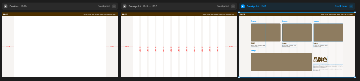
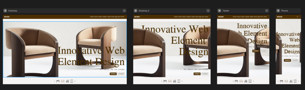
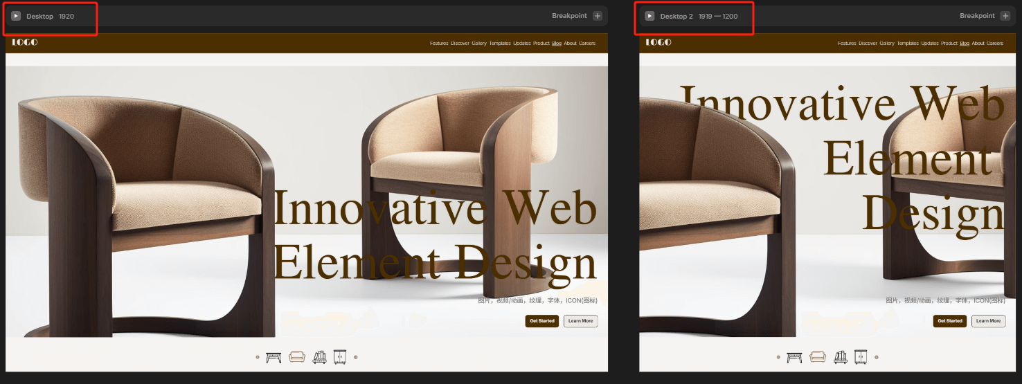
The core of web design lies in "fluid layout," rather than rigid, fixed-size formatting. We need to automatically adjust the layout structure based on the screen width of the user's device, which introduces the concept of "breakpoints." By setting multiple breakpoints, the webpage can display different layouts at different resolutions, ensuring that the browsing experience is consistent and user-friendly across various devices. In actual page design, the blogger often sets two key breakpoints for the desktop version:
- Large Screen Breakpoint (>1920px): Mainly used for 4K or high-resolution large screens, emphasizing visual tension and layout extension;
- Medium Screen Breakpoint (1920px – 1919px): Suitable for mainstream laptops, desktop computers, and other office devices, this is the core device range for desktop access.
In addition, the blogger also tends to categorize below 1199px as tablet and mobile breakpoints, further optimizing the adaptation for mobile devices. However, in desktop design, I insist on keeping the two size breakdowns based on a core judgment: desktop users are still the main source of visits for most websites. Especially for corporate websites, B2B, and other types of sites, the visual experience of large screen visitors determines the first impression of the brand. Therefore, a single breakpoint is far from enough.
(2) Flexible Content: The "Soul" of Responsive Design
To achieve truly responsive design, various elements on the webpage also need to have flexible scaling abilities. Below are a few common flexible strategies:
Flexible Image and Video Handling
All media content (such as images, videos, 3D animations) should use percentage units or max-width: 100% to ensure they don't exceed their container boundaries, avoiding misalignment or overflow on different resolutions.
Font Auto-scaling Handling
Different screen sizes have varying readability requirements for fonts, so it's recommended to use units like em, rem, or CSS's clamp() function to control the font scaling range. For example:
font-size: clamp(1rem, 1.5vw, 2rem);The above method ensures that the font is not too small on smaller screens and won't get too large on larger screens, providing a good reading experience.
Using Viewport Height (vh) Units
To more precisely control vertical element sizes on different devices, using vh (viewport height) as a unit is a better choice. For example, a full-screen banner section can be set with height: 100vh to ensure it occupies the full viewport on various devices.
2、Tablet Responsive Design
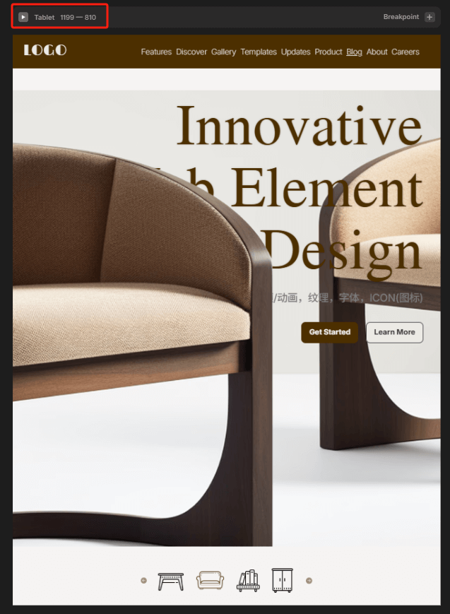
In the landscape of multi-device adaptation, the tablet is often seen as the "middle ground" between desktop and mobile. It offers a larger display area while retaining some touch capabilities, so both layout strategies and interaction logic need to be considered independently. In the actual web design process, the blogger defines the tablet range as 768px to 1199px in width. This breakpoint covers most mainstream iPad and Android tablet devices, including the iPad mini, iPad Air, and Android tablets.
3、Mobile Responsive Design
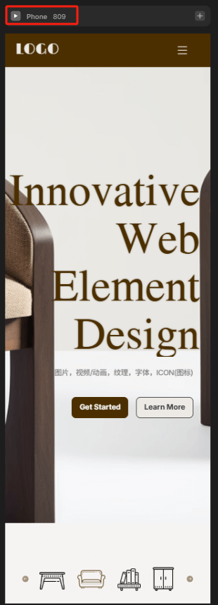
In responsive web design, mobile layout is the most challenging and critical aspect. Due to the smaller screen size of mobile phones, the information-carrying capacity is limited. Therefore, when planning the layout, it is important to start from the smallest device width to ensure basic readability and usability. In the blogger’s actual web project design, 360px is commonly used as the minimum width reference for mobile layouts. This is the minimum standard size for most Android phones and iPhone SE, covering the usage scenarios of the vast majority of mobile devices. Starting from the smallest breakpoint ensures that the page displays correctly across various phone models and enhances the page’s compatibility in extreme environments. In practice, media queries are used to set breakpoints smaller than 768px, with 360px as the core reference point. The layout is then built step by step and adjusted using percentage width, flexible box model (Flexbox) or grid systems to expand adaptively, achieving a smooth transition from small to large screens. This "small-to-large" fluid layout logic is more reliable than the "large-to-small" compression strategy. Elements like images, buttons, and text within the page should also undergo adaptive handling, such as setting max-width: 100% to prevent images from overflowing their containers, and using em or rem to control font size, ensuring clear and readable visual experience across different mobile models. In mobile design, special attention should also be given to the touch experience. Since users mainly rely on fingers for interaction, interactive elements must have sufficient clickable areas (recommended to be greater than 44px), and spacing should be reasonable to avoid accidental touches. Additionally, to improve loading efficiency and performance, the mobile page should streamline the code structure, optimize image size, and avoid unnecessary animations and large scripts, ensuring fast response even on 4G or 5G networks.
Conclusion: With the advancement of technology and changes in market demand, web design will continue to move towards a more personalized and diversified future. WEB designers not only need to focus on breakthroughs in aesthetics but also integrate user needs and interaction experience into every detail. In 2025, whether through innovative layouts, color schemes, or utilizing modern technological methods, web design will continue to lead new forms of interaction between users and brands. Continuous optimization and improvement, creating smarter and more user-friendly digital experiences, will be important directions for the future development of web design. In this ever-changing era, only by grasping trends, emphasizing innovation, and balancing functionality with aesthetics can one stand out in a competitive market and embrace a broader future.
The content in this article (including videos/images) is original and copyrighted by Logic Digital Technology (SZLOGIC), and is welcome for personal sharing and learning. Unauthorized use of this article for any commercial purpose or reproduction is strictly prohibited.