Web Design 11 Classic Styles of Website Design
The presentation of a website's style is the intuitive manifestation of the integration of various elements in the entire web design process. Style is not just a "tone" visually, but an important means of conveying the brand's personality, attracting target users, and creating an emotional atmosphere. Therefore, planning the website's style is often the starting point of the entire page design process, and it is the most fundamental yet strategically significant step. The style type of a website largely depends on the website's positioning and attributes, with the most crucial reference being the type of products or services the website carries. Different industries and business models have essential differences in their style requirements. For example, technology companies pursue a futuristic and minimalist style, cultural websites emphasize artistry and expressiveness, while e-commerce sites focus more on visual impact and guiding users towards making purchases.
Based on years of web design practice serving various enterprise clients, the company where the blogger works—Shenzhen Logic Digital Technology—has summarized and refined 11 of the most representative web design styles through systematic project analysis and visual aesthetic evaluation. These styles cover various industry scenarios such as technology, art, fashion, manufacturing, education, finance, and lifestyle. Not only do they have high recognition, but each also corresponds to different design logic and user communication methods. This article analyzes the visual characteristics, applicable scenarios, and design key points of these 11 mainstream web styles one by one, helping website design planners for enterprises precisely select a visual direction that matches their brand tone, thereby building a more attractive and communicative website image.
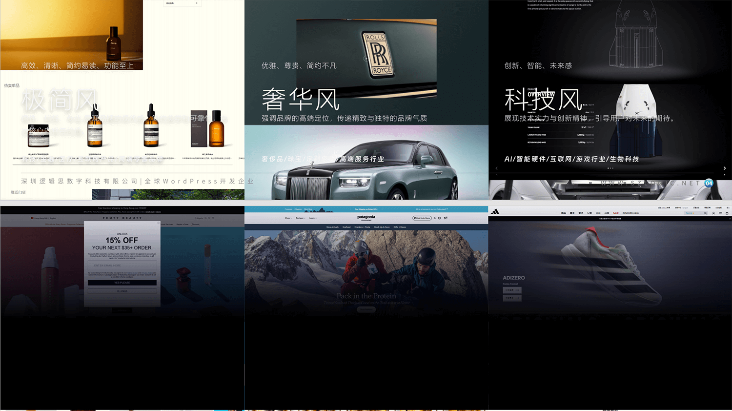
Ⅰ、Web Design — Minimalist Style
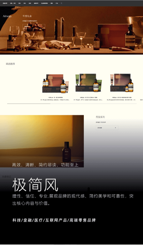
In contemporary web design, minimalist style is not only a visual representation but also an extension of design philosophy. It originated from the "Minimalism" aesthetic of the 1960s and became mainstream after Apple introduced the "Less is more" concept in the 2000s. Minimalism centers on "form follows function," not emphasizing decoration and complex visuals, but instead focusing attention on the efficiency of information delivery and the convenience of user interaction. The essence of this design style is to eliminate all unnecessary distractions, allowing users to quickly pinpoint key content in the midst of a complex information environment, thereby improving the speed of content comprehension and interaction efficiency.
In terms of visual layout, the minimalist style is based on ample white space, wide margins, and clear information hierarchy, emphasizing a sense of breathing room and visual rhythm between the content. The layout often adopts symmetrical or grid-based distribution, avoiding flashy backgrounds and redundant decorative graphics, presenting core information in a clean, tidy, and well-organized manner. For typography, it favors thin lines and sans-serif fonts, such as Helvetica, Roboto, or SF Pro Display, which have strong modern appeal, excellent readability, and a calm, professional atmosphere. In terms of color selection, neutral tones like black, white, and gray dominate, along with high-lightness, low-saturation blues, beige, and cool greens, creating a restrained, rational, and sophisticated visual atmosphere.
The minimalist style is also reflected in the interaction logic. All interactive designs follow the "function over form" principle, with interface components such as buttons, forms, and navigation bars presented in the most intuitive way for the user. The paths are simple and clear, with no additional learning curve. Common visual enhancement techniques include subtle outer glow, shadow layering, linear icons, and micro-animations, which neither overpower the design nor distract the user but appropriately guide their attention. This design approach greatly improves the overall usability and reliability of the webpage, allowing users to be more focused and relaxed during interaction.
From a brand positioning perspective, the minimalist style is especially suitable for industries and brands that aim for modernity, technology, professionalism, and high trustworthiness. For example, a technology company's website can highlight its cutting-edge and efficient nature through minimalist design; industries like finance and healthcare can use it to create an image of stability and trust; and in high-end retail and e-commerce, the minimalist style also becomes a key way to emphasize product quality and brand elegance. It can be said that minimalist style is not "the absence of design," but rather "precise expression." It uses the fewest design elements to achieve the maximum transmission of information and brand value.
Ⅱ、Web Design — Modern Luxury Style
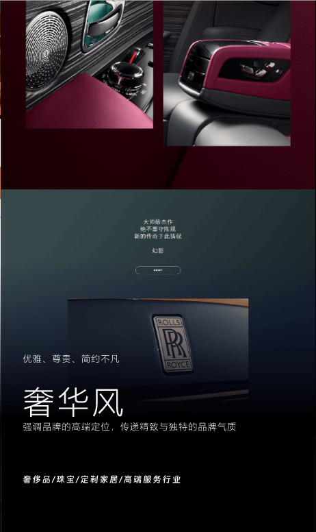
In the aesthetic evolution of contemporary web design, the modern luxury style is becoming an important visual expression for high-end brands and custom service industries. Unlike traditional notions of opulence, characterized by ornate Baroque, Rococo, or classical Chinese luxury, modern luxury style emphasizes "understated elegance" and "extraordinary simplicity." It does not rely on heavy decorations to convey a sense of prestige; instead, it creates a high-end, elegant, and tasteful brand image through meticulously crafted details, sophisticated typography, and visually rich materials. This style is widely used in websites for luxury goods, jewelry and watches, high-end customization, art, flagship e-commerce, fine dining, and lifestyle brands, serving as one of the core methods for conveying product value and brand taste.
From the perspective of layout design, modern luxury style emphasizes a visual construction of "subtle balance." The page often adopts a symmetrical structure or a golden ratio arrangement, and also achieves overall harmony and a focused visual center through the clever distribution of visual elements on the left and right. The entire interface seeks restrained yet powerful information hierarchy, with white space used appropriately to avoid overcrowding, enhancing the visual breathing space while highlighting key products or important content. In terms of the page's primary color scheme, high-end, sophisticated color combinations are often used, such as ivory white, champagne gold, dark gray, sapphire blue, wine red, and deep green, complemented by high-brightness metallic gloss or soft light gradients, creating a calm and unique visual atmosphere.
In terms of visual materials, the modern luxury style has extremely high requirements for images and videos. Images often focus on the product's intricate details, highlighting craftsmanship such as the texture, materials, and structure through macro shots. For example, the reflection on the cutting surface of a ring, the mechanical inner workings of a watch, or the stitching and edging of a leather bag. Composition pays attention to the smoothness of the outer contour lines and the creation of light and shadow relationships, with backgrounds typically clean and restrained to emphasize the meticulous craftsmanship of the product itself. Videos, on the other hand, tend to move at a slow pace, avoiding the impact of fast editing. They often use techniques such as panning, slow focusing, and gradual lens transitions, naturally guiding the viewer’s attention to the details. This immersive experience allows users to feel the precision of the product's craftsmanship and the brand's tone. For instance, under changing lighting, a custom handbag's transformation from leather texture to the gleam of its metal buckle can strongly convey quality and sophistication.
In terms of font selection, the modern luxury style tends to favor fonts with a modern feel and elegant curves, such as high-contrast serif fonts (like Playfair Display, Didot) or refined sans-serif fonts (like Avenir, Lato). The typography emphasizes hierarchical information, with main titles offering a sense of ceremony, while the body text is designed for extreme readability. As for animations, restrained micro-animations are used, such as subtle fade-ins, scrolling parallax easing, or delicate interactive feedback, enhancing the flow of the page without disrupting its overall elegance. What the modern luxury style presents is a "quiet yet extraordinary" sense of sophistication. It doesn't overemphasize symbols of luxury, but rather strikes a precise balance between minimalism and craftsmanship, allowing users to feel the nobility, uniqueness, and trustworthiness the brand wants to convey during their browsing experience. This style not only elevates the brand's tone but also continues the exclusive feeling of high-end offline services in the digital experience.
Ⅲ、Web Design — Technology Style
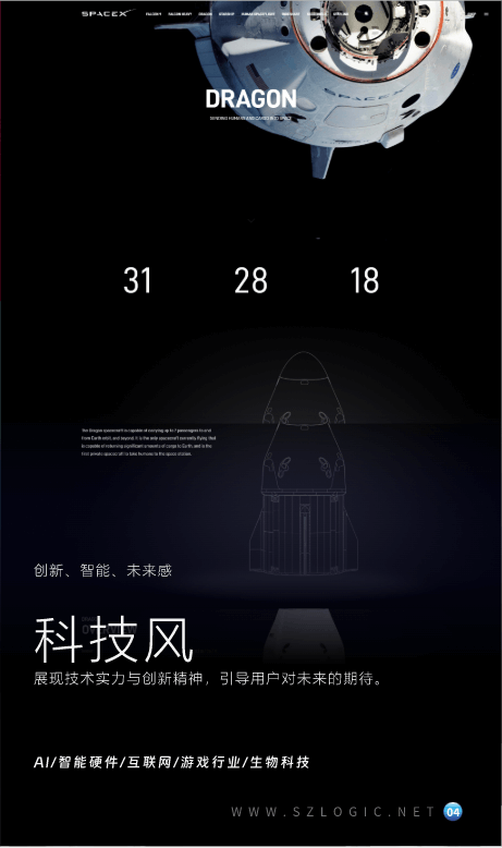
In today's rapidly advancing digital technology landscape, more and more brands and businesses centered around technological innovation are actively leveraging websites to showcase their leading capabilities and forward-thinking ideas. The technology style of web design has thus emerged as the preferred visual language for fields such as artificial intelligence, smart hardware, internet platforms, game development, biotechnology, and smart home appliances. This style not only conveys the brand's technological background and professional credibility but also creates an immersive visual experience that sparks users' imagination and aspirations for the future. Technology-style websites are no longer just carriers of information; they serve as dynamic platforms for showcasing the spirit of technological exploration.
In terms of interface layout, the technology style typically adopts a modular and layered design, with each content section having clear divisions of hierarchy and functionality, allowing users to quickly grasp the key points in complex information. Interaction design is especially crucial. To emphasize interactivity and technical depth, technology-style websites extensively use 3D animations, scroll-linked animations, visual penetration paths, delayed loading, and particle systems. These dynamic effects not only enhance visual appeal but also reflect the brand's technical strength and innovation capabilities. Especially when showcasing hardware construction, product functionality logic, or system architecture, using technical animations or interactive demonstrations allows users to understand complex systems as if they were immersed in them, making this a core feature of technology style design.
In terms of color usage, the technology style aims to create a "futuristic" and "technological" atmosphere, preferring a color palette based on dark tones and cool hues. Shades such as deep blue, black, and silver-gray create a calm, high-end, and deep visual atmosphere, commonly seen on AI platforms, biological labs, blockchain websites, and similar pages. At the same time, to enhance visual impact, bright accent colors like electric blue, fluorescent green, bright orange, and ultra violet are often used to highlight key elements like buttons, data prompts, and animation paths, strengthening the technological atmosphere and guiding user actions. In terms of font selection, the technology style pursues sharp, futuristic visual expression. Modern sans-serif fonts with distinct edges and balanced letter spacing, such as Futura, Orbitron, SF Pro, Exo, or Roboto Mono, are commonly chosen. These fonts convey a sense of order and strength visually, making them particularly suitable for showcasing code, technical concepts, and modular structures. At the same time, text layout may include lighting effects, glowing fonts, dynamic data switching, and other design elements to create an active and cutting-edge visual experience.
In terms of specific interface details, the technology style also heavily utilizes visual elements with a "futuristic feel," such as glowing borders, transparent frosted glass textures, dynamic grid backgrounds, spatial layer overlaps, dynamic lighting and shadow projections, radar scan lines, particle trajectory animations, and more. These elements combine to create an immersive experience that feels like being in a future laboratory or digital world. Especially on the homepage or brand showcase pages, combining video backgrounds or real-time data flows can create a strong first impression of the brand's technological appeal.
IV、Web Design — Friendly Style
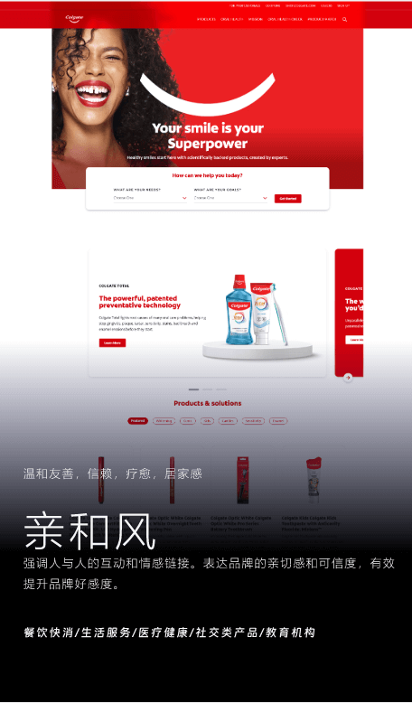
Friendly style web design has gradually become the preferred visual expression for many brands in recent years, especially in industries such as food & beverage, fast-moving consumer goods, lifestyle services, healthcare, maternity products, pet care, and social products. As the demand for emotional connection with brands continues to rise, websites are no longer just tools for conveying functions and information but have become important carriers for building emotional resonance and conveying warmth and care. The core of the friendly style lies in evoking the user's inner feelings of "security," "companionship," and "trust" through visuals, interactions, and content language, thereby enhancing the brand's likability and customer loyalty.
In terms of visual layout, the friendly style focuses on providing a soft and comfortable sensory experience. The design typically features a lot of white space, allowing the page to breathe and avoiding visual overload caused by high information density. The composition of the page is also more natural and fluid, emphasizing the balance between content and visual rhythm, ensuring that users feel relaxed and pleasant while browsing. The font selection leans towards rounded, non-angular styles, often seen in handwriting fonts or sans-serif fonts with a geometric feel but rounded corners, such as Nunito, Poppins, and Quicksand. These fonts convey a sense of gentleness, warmth, and approachability.
Color matching is one of the core languages of the friendly style webpage. This style typically uses warm colors and medium to high brightness with low saturation to create a cozy and friendly atmosphere. Colors like cream, beige, light orange, muted pink, sky blue, and misty green often serve as the main color scheme for the page. These color combinations not only evoke feelings of nature, sunshine, life, and health but also help trigger a sense of psychological relaxation and trust in users. For brands that emphasize a healing atmosphere, gradient backgrounds, soft lighting, or semi-transparent color blocks are often introduced to enhance the sense of layering.
The friendly style also reflects a strong sense of everyday life and humanistic care in the selection of images and video materials. The images often feature real-life, warm moments captured in natural light, such as family meals, gatherings with friends, parent-child interactions, and pet companionship. These visuals help users subtly establish an emotional connection with the brand, making it feel as if the brand is a “friendly neighbor.” In terms of video materials, the friendly style favors slow, smooth dynamic shots, such as the silhouette of sunlight falling by the window, the lightness of curtains fluttering in the breeze, or slow-motion captures of smiling faces, creating an atmosphere of emotional stability and gentle immersion. Additionally, in terms of interaction experience, friendly style design tends to be simple, intuitive, and user-friendly, avoiding complex jumps and redundant operation paths. Buttons often feature rounded corners and soft transition animations, with micro-interactions that are delicate yet understated, making the user experience feel almost seamless, as if interacting with a "warm product." These subtle details are also one of the key factors in the success of the friendly style in moving users.
Ⅴ、Web Design — Artistic Style
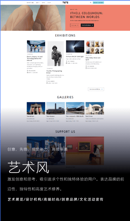
In today's web design, the artistic style, with its high degree of visual freedom and expressiveness, has become a key choice for many creative brands to showcase their personality and artistic attitude. This style is commonly used in industries such as design studios, contemporary art platforms, trendy brands, high-end fashion brands, or cultural institutions. These industries typically have much higher visual expression needs than others and rely on the web as a medium to convey the brand's avant-garde, originality, and unique visual language. Therefore, artistic style web design often breaks away from traditional layout structures, leaning toward unconventional, personalized presentations to create a distinctive visual identity.
The layout of artistic style web design offers immense flexibility and creative space. While some arrangements still rely on grid systems to ensure basic visual order, the overall focus is on the visual tension created by breaking the rules. Designers can opt for asymmetrical compositions, fragmented layouts, overlapping text and images, and other techniques to create a strong artistic atmosphere without compromising readability. In terms of color, artistic style web design breaks from convention, boldly using high-contrast color clashes, strong color gradients, or creating contrast with minimalist black, white, and gray to evoke intense emotional impact. As for typography, custom fonts, handwritten styles, and deformed fonts are commonly used, sometimes even treating the fonts themselves as part of the artwork, emphasizing their visual expression rather than merely conveying information. For images and videos, artistic style web design may feature art photography, avant-garde installations, abstract illustrations, hand-crafted brushstroke paintings, and even the designer's own works, creative animations, and generative art. This multifaceted approach enhances the curatorial feel of the web page, making it a true art exhibition.
VI. Web Design — Playful Style
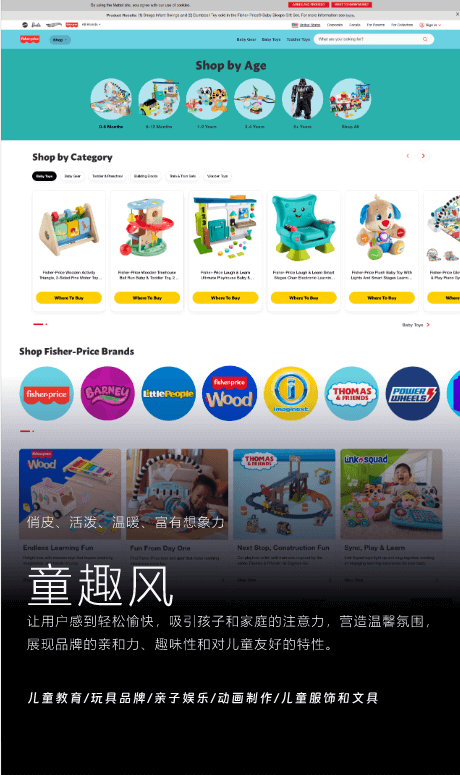
The playful style of web design is specifically tailored for industries related to children, including children's education, parent-child entertainment, toy manufacturing, children's products, picture book publishing, animation production, and more. The core of this design style is to convey the brand's energy, warmth, and sense of fun, ensuring that both parents and children can not only easily access information but also enjoy a pleasant visual experience and emotional connection while browsing the website. Compared to other styles, the playful style does not emphasize a rigorous professional feel, but rather focuses on approachability and interactivity. This visual language plays a key role in determining whether a brand can quickly win the audience's favor.
Playful style web design breaks away from conventional layout rules, leaning towards a more free-flowing, dynamic, and rhythmic arrangement. The page rhythm is varied yet not chaotic, creating an interface that feels relaxed while sparking curiosity. Elements in the layout can break free from symmetrical and rectangular constraints, using more lively curves and visual flow effects. Coupled with playful graphic decorations and small dynamic interactions, this approach enhances the interactivity and storytelling aspect of the entire page. Color plays an extremely important role in playful style web design. To capture the attention of both children and parents, the overall color scheme often uses highly saturated and bright colors, such as bright yellow, soft green, orange-red, lake blue, light purple, etc. The collisions between these colors not only avoid causing confusion but also contribute to a strong sense of playfulness. Additionally, the fun color combinations and contrasts can communicate the brand's creativity and imagination, giving the page a higher level of playfulness and visual memorability.
In terms of graphics and visual details, playful style web design heavily utilizes hand-drawn illustrations, rounded borders, handwritten fonts, dotted textures, cartoon patterns, and other visual languages. These elements effectively reduce the "technical feel" of the page, enhancing warmth and approachability. Cartoon-style 3D animations, especially small animations featuring animals, toys, and children's products, have also become one of the popular design languages in playful web design in recent years. These animations not only capture children's attention but also elevate the interactive fun of the page.
VII. Web Design — Natural Style
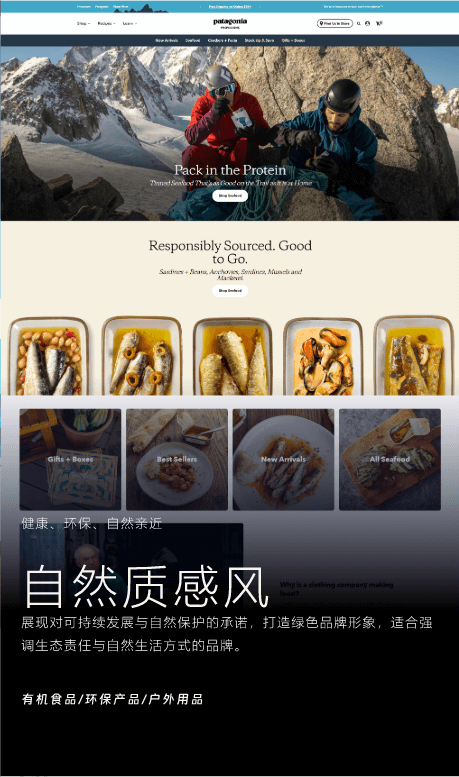
Natural style web design has become increasingly popular among brands and designers in recent years, especially with the rise of green consumption trends and growing ecological awareness. This style primarily serves brands that emphasize natural, organic, and environmentally friendly concepts, such as organic food, biotechnology, natural skincare products, outdoor gear, and eco-friendly lifestyle platforms. The goal of natural-style websites is not only to convey the functional value of the products themselves but also to emphasize the brand's ecological responsibility, sustainable development concepts, and a return-to-nature lifestyle. Therefore, these websites often focus more on emotional communication and value resonance, using delicate visual language to build trust and recognition of the brand's philosophy among users.
In layout design, the natural style does not adhere to traditional grid systems and rigid structures but encourages free-flowing and "organic" arrangements. Designers can flexibly position elements based on the content of the page, creating a visual rhythm that is full of vitality through asymmetrical structures, loose white space, and naturally extending movement lines. This layout style is more in line with the state of nature itself and provides users with an immersive experience as they browse. The choice of colors is the core of visual expression in the natural style. Pages typically feature natural color schemes close to the earth, such as light green, forest green, moss green, brown, beige, ivory white, and sky blue. These soft colors with medium saturation and moderate to high brightness help create a warm, tranquil, and comfortable atmosphere, evoking an instinctive closeness to nature. In the use of color blocks, natural textures are often incorporated as accents, such as wood grain, water ripple patterns, linen textures, and organic lines, giving the webpage a tactile and realistic feel.
The use of images and materials is also a key element in shaping the natural style of a webpage. It is recommended to use outdoor scene photos taken in natural light or lifestyle product shots, with backgrounds such as forests, fields, mountains, coastlines, or log cabins. These images are often unretouched or only lightly edited with warm filters to enhance the raw and authentic visual feel. If video materials are used, they often feature slow-motion shots of natural changes, plant growth, or cloud movement, visually conveying a relaxed rhythm and a serene mood. In terms of font selection, natural style prefers simple, rounded sans-serif fonts, or those with a handwritten feel and organic curves. These fonts help increase the webpage’s warmth and emotional appeal, avoiding an overly industrial or technological feel. When necessary, hand-drawn icons or illustrations can also be introduced as accents to enhance the overall humanistic atmosphere of the page.
The essence of natural style webpages is "to convey the brand spirit in the name of nature." It does not rely on flashy animations or complex interactions, but instead creates a brand image that is close to nature, warm, and trustworthy through attention to detail and a unified overall tone. This design approach is especially suitable for businesses that prioritize sustainability and emphasize the communication of brand values.
Ⅷ、Web Design — Sports Style
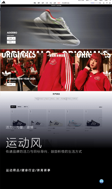
The application of sports style in web design primarily serves brands whose core brand identity revolves around "youthful energy," "vitality," and "sportsmanship." Typical examples include sportswear brands, gyms, sports equipment, trendy sports tech products, and surrounding cultural brands. This style aims to convey the brand's energetic, proactive, and self-challenging spirit through bold visual language and dynamic design. As contemporary users increasingly pursue healthy lifestyles, personal expression, and physical awakening, sports-style websites not only fulfill the function of information display but also serve as an efficient visualization of the brand's spirit.
In terms of layout structure, sports style emphasizes a sense of speed and movement. Therefore, the design often breaks away from traditional symmetrical and centered layouts, instead using a large number of asymmetric and dynamic arrangements to create a visually strong rhythm, guiding users to browse the page at a faster pace. Modular design is common, with sections separated by slanted lines, broken frame layers, or dynamic visual elements, giving the entire page a strong sense of direction and motion, creating a continuously "moving" visual atmosphere. In terms of color, sports style favors high-contrast visual impact, with common color combinations including bright red + black, orange + white, bright yellow + dark blue, and fluorescent green + charcoal black. These high-saturation, high-brightness color schemes instantly capture users' attention while reinforcing the brand's youthful, passionate, and energetic image. Color is often applied in large areas and through gradients to enhance visual impact, combined with angled panels and motion effects to further emphasize the dynamic feel.
In terms of typography, italic fonts, bold sans-serif fonts, and distorted typefaces all contribute to creating a sense of "speed" and "strength" for the page. These fonts are often used for primary visual slogans, functional section titles, or brand slogans, providing both a powerful visual impact and an athletic atmosphere. At the same time, text formatting is often paired with dynamic effects such as scrolling, bouncing, or sliding in/out animations to enhance user interaction impressions. For imagery, sports-style websites tend to focus on dynamic human forms, especially capturing moments of explosive power, posture changes, and bodily tension in athletes or models during motion. This use of human movement intensifies the sense of life on the page. Images and video materials should employ high-speed shutter or slow-motion techniques to highlight details such as muscle lines, sweat, water droplets, and motion trails, often accompanied by light and shadow cutting and dynamic backgrounds to enhance visual tension and depth. For interactive elements, 3D dynamic interactions, micro-interactive buttons, and flowing layers with technological effects can be added to create a more immersive visual experience.
In addition, in terms of interactive design, sports-style websites place great importance on response speed and visual feedback. The operation logic should be clear and straightforward, buttons should be prominent and direct, and the interaction path should be simple and smooth, allowing users to feel speed, rhythm, and a sense of ease during their interactions. The overall visual and interactive rhythm needs to align with the brand's language and marketing pace, enhancing the user's sense of immersion and participation while maintaining strong brand recognition. Sports style is not just a visual aesthetic; it is an external expression of the brand's spirit. Through the highly coordinated use of color, typography, motion effects, and content, it creates a dynamic digital space. In web design, it is especially suitable for brand expressions that emphasize "action," "youthfulness," and "user experience," making it one of the most influential style trends.
IX、Web Design — Soft Style
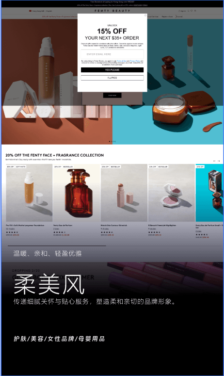
The soft style is primarily aimed at brands and businesses targeting female audiences, such as skincare, beauty, cosmetics, women's fashion, maternity products, and home living brands. This style conveys not only visual softness but also a brand temperament that combines delicacy, gentleness, romance, and relaxation. It creates not just a feminine impression, but a visual experience centered around women's emotions and lifestyles, allowing users to feel comfort, care, and elegance while browsing. The overall layout emphasizes lightness and a sense of breathing, with information distributed in a non-symmetrical or compact way. Instead, appropriate white space and naturally extending layouts make the page feel relaxed, orderly, and well-layered. The soft, flowing visual rhythm creates a light and delicate psychological sensation during browsing, making it suitable for brands that emphasize product sophistication or quality of life.
In terms of typography and graphics, the soft style often uses rounded, delicate line structures. Whether it's the body text or graphic elements, the style tends to lean toward soft and gentle aesthetics. The fonts can be serif fonts with a floral touch or thin and elegant sans-serif fonts. Through adjustments in letter spacing and stroke, the overall visual appeal is enhanced. Decorative lines are usually soft curves, wavy lines, or plant-like lines, softening the page’s hard edges and creating a smoother, more natural visual flow. Color pairing is a key element of the soft style. These pages typically use medium-saturation (40%-60%), high-brightness (70%-90%) tones, with a focus on pinks, nude tones, cream yellows, soft purples, and light gray blues. Gradients or low-contrast transitions are often used, giving the entire page a soft, tranquil, and layered texture. Compared to the friendly style, the soft style’s colors are lighter and more unified, with a dreamy, ethereal quality.
In terms of materials, the soft style often uses product environment images or lifestyle scenes captured in natural light. The people in the images typically present a soft, relaxed demeanor, emphasizing genuine, intimate emotional connection. Common processing techniques include soft focus, warm-tone filters, and subtle halo effects. The page often features concrete elements like flowers, mist, feathers, and fabric textures, adding tactile quality and detail to the visuals. In terms of motion design, the soft style favors slow, gentle animations, such as fade-ins, smooth sliding, and subtle zooms. These mild animations reduce any abruptness during user interaction, making the experience more aligned with female users' habits, increasing both the enjoyment and emotional resonance of the web experience.
It is worth noting that the style of modern female users is becoming increasingly diverse, and gentle romance is no longer the only visual expression. They can also be sharp, independent, or even full of tension. Therefore, based on the soft style, some brands appropriately incorporate minimalist, sleek, or futuristic design languages, achieving a mix-and-match interpretation of styles to present a more complex and authentic female brand image. The essence of the soft style in web design is to establish a deep emotional connection with users by creating visual warmth. It can be both soft and delicate, as well as full of strength. It is one of the most inclusive and versatile styles in contemporary web aesthetics.
X、Web Design — Retro Style
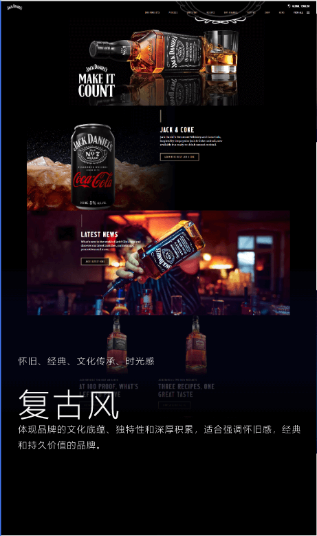
Retro style, although a relatively niche visual type in contemporary web design, possesses high recognizability and cultural tension. It is particularly suitable for companies and projects that emphasize their brand’s historical heritage, craftsmanship, or the reproduction of cultural classics. It is commonly seen in themed restaurants, artisanal brands, cultural and creative products, classic fashion, cultural institutions, as well as in industries like alcohol, tea culture, and more. Retro style is not merely synonymous with "old"; rather, it is a reinterpretation of classic elements within the context of contemporary design—a nostalgic aesthetic that transcends time. In the design process, the key to retro style lies not in simply piling on old elements, but in evoking users’ collective memories and emotional resonance tied to a specific era, emotion, or culture. The overall layout of a retro-styled webpage can be free from rigid symmetry or modern modular structures but should still maintain clarity and visual order to avoid confusion. In terms of visual presentation, retro style showcases distinct differences between Western and Eastern styles, so it is essential to clearly define the target audience's cultural background and the brand’s tone when selecting design elements and positioning.
In the direction of Chinese retro style, a grid-based modern layout structure is often integrated, while incorporating fonts with traditional calligraphic or scholarly characteristics, such as handwritten, calligraphy, or imitation Song style fonts, especially in titles and main visual areas. This creates a contrast between the old and the new, blending both aesthetics. The color palette typically uses medium to low saturation, warm and soft retro colors, such as bean red, ink green, deep blue, tea color, and slate blue, with occasional use of contrasting colors to add depth. In terms of materials, photos that have been aged or given a vintage effect are suitable, simulating the texture of film or the graininess of old photos. For graphical textures, traditional Chinese patterns such as the key pattern, cloud pattern, or water ripple pattern can be used, which are understated yet rich in meaning.
In the presentation of Western retro style, the overall aesthetic leans more towards European classical aesthetics, such as Victorian style, advertising posters from the 1950s and 1960s, or Renaissance-period design elements. Font choices often include Western script fonts, handwritten styles, or vintage serifs, such as Garamond, Caslon, and Didot, paired with rich, aristocratic color schemes like gold, silver, wine red, and deep brown to create an atmosphere that blends nobility, elegance, and historical depth. The page layout can incorporate elements like old newspaper-style typography, nostalgic illustrations, retro wallpaper textures, or close-up images of antique objects to naturally connect the brand with the dimension of time.
In terms of animation effects, retro style does not emphasize speed or flashy techniques; instead, it is more suited for using slightly slower, fade-in, sliding, or old movie-like animation methods. The entire page can create an immersive feeling of "time slowly passing," allowing users to experience emotional projection as if they are entering a serene space from a bygone era. The charm of retro-style web design lies not in replicating history, but in using modern design language to evoke people's recognition and emotions related to past cultures, establishing a warm bridge between the past and the present. It makes the brand appear more cultured, storied, and deep, while also offering users a moment of gentleness and nostalgia amidst the fast-paced digital experience.
XI、Web Design — Industrial Style
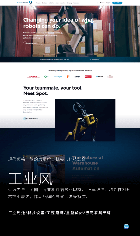
Industrial style is a design approach that emphasizes modern hardcore aesthetics, minimalist strength, and the fusion of mechanical technology. It is particularly suitable for companies or brands that seek to project a professional and trustworthy image, with a strong technical capability and functionality, especially in industries such as industrial manufacturing, tech equipment, engineering construction, and heavy machinery. This style conveys a calm, rational, powerful, and highly technical corporate image through its unique visual language. It breaks away from traditional soft design styles, offering a stable, rigorous, and forceful visual impression. In industrial web design, the layout is characterized by a rigorous, grid-based structure. The hierarchical relationships of page elements are clear, and the layout is highly logical, avoiding any redundant or unnecessary design details. The overall typography follows a strict framework and organizational principles, similar to how an engineer approaches tasks with precision and efficiency. This design philosophy directly reflects the brand or company's meticulous attitude toward product quality, technological innovation, and business processes. It aims to communicate the professionalism and reliability of the company, allowing users to feel the brand's credibility and trustworthiness.
In terms of font selection, industrial style often uses bold, mechanical, and angular sans-serif fonts. These fonts typically have simple geometric structures, greatly enhancing the modernity and strength of the webpage. Common fonts like Roboto, Helvetica, and Arial are frequently used, as they have a strong, technical feel that complements the mechanical design of the page, making the text content appear both clear and visually striking. In terms of color palette, industrial style favors cool tones such as metallic gray, black, white, deep blue, and steel gray. These hues are low in saturation and create a calm, robust atmosphere. The use of these deep color combinations not only showcases the technical strength of the company but also gives the entire page a precise and professional visual effect. This color scheme is often enhanced through light and dark contrasts, boosting the design's depth and ensuring that each element stands out clearly against the background.
In terms of interaction design, the industrial style tends to favor simple and programmatic interactions, avoiding excessive flashy CSS animations. The design of forms and buttons is usually very straightforward, following clear operational paths to enhance the efficiency and smoothness of user interactions. This design style emphasizes "function first," allowing users to quickly access the information they need without being distracted by complex operations or cumbersome visual elements. In addition, 3D interaction is also an important element in industrial-style web design. By utilizing 3D animations and model displays, it effectively showcases the mechanical and technical aspects of industrial products, helping users more intuitively understand the structure, functionality, and usage scenarios of the products. Dynamic interaction not only enhances user immersion but also strengthens the sense of technology and futurism in the brand, providing users with more visually impactful and deeply engaging web content.
Conclusion: These 11 web design styles are a summary and categorization by Logic Digital Technology of the current web design trends, covering the needs of most industries in the market. Therefore, if readers plan to proceed with custom web development, it is recommended to first understand these 11 foundational styles to see which one best aligns with your company's brand image. Once the basic style of the website is determined, the development and communication time will be significantly shortened, and the visual decisions during the design process, which might seem subjective, will become more rational, making the final web design outcome closer to your expectations. Additionally, if you need professional website design and development services, feel free to contact our team. The web designers and front-end and back-end developers at Logic Digital Technology will provide you with a professional three-in-one website design and development solution, including visual design, user experience design, and marketing design.
For those without a design background, these 11 styles may seem a bit complex, but they can actually be understood by anthropomorphizing them. For example, industrial style gives off the vibe of an engineering student; the playful style feels like an innocent and lively child; the soft and feminine style presents the image of a gentle and elegant woman; while minimalist style resembles a minimalist architect, dressed in a simple black and white suit, neat and sharp. Web design is like dressing these character-like personas, a process that is both creative and fun. You may have concerns and wonder if designing all websites according to these 11 styles could lead to a sense of homogenization. But in fact, when defining these styles, we intentionally included the word “basic,” meaning that during the development process, we will refine and customize the style based on the specific needs of the brand, in order to meet the personalized demands of clients in various niche markets.
The content in this article is the original work and copyright of Logic Digital Technology (SZLOGIC). Personal sharing for learning purposes is welcome. Unauthorized use for any commercial purposes or reproduction is strictly prohibited.